Archive for June, 2009
The never-ending exposure as payment problem: Some Illustrators talk out against Google.
art market blog the exposure problem
When Gary Taxali gave Google the finger (both in words and pictures) over 200 other illustrators and artists cheered him on. Taxali wrote a post on Drawger that gained a lot of attention and apparently some legal threats as the post has now been taken down. The New York Times today has reported on it here: Use Their Work Free? Artists Say No to Google. And Reuters has an article with a bit more back story: Artists Give Google the Finger
Basically, it goes like this. The economy is down, so people are trying to wring their freelancers for rights and free work. This is such a common problem. Don’t people realize that if enough people stop paying for work, eventually there won’t be anyone to do the work. People have to make money at their work, whether it be illustration, art, architecture, floral design, catering, or any other service or product.
People have to hold their ground collectively, otherwise the whole field gets screwed. That’s not so easy to do though.
Striking a chord: Art house interventions
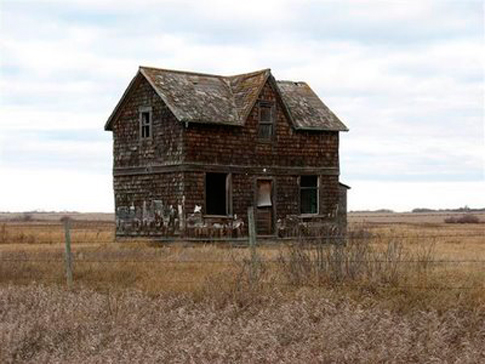
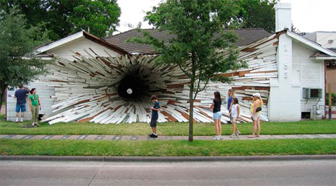
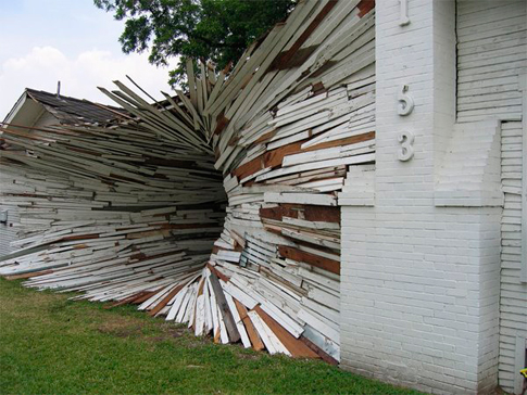
The two projects below are recently striking a chord over the intertubes though both are a little bit old. Maybe because of the foreclosures that are running rampant, or because of places like Detroit, where whole city blocks are abandoned, these house interventions seem to me especially apt.
 Artist: Heather Benning (no website found), Dollhouse, 2007
Oliver and I have been spending some of our time looking to buy a house, some of which are foreclosures, short sales, or even multi-units. Yesterday we looked at a triplex where two of the apartments had residents, two older gentlemen, who had obviously lived there forever. We walked through their apartments, getting a little glimpse into their lives. Other houses, though vacant, clearly show remnants of the past residents: a door covered in a child’s favorite stickers, outlines on the walls of every picture in the house. Saskatchewan artist Heather Benning’s “Dollhouse”, though re-created, gives us this same sense of loss and mystery that remains when you see the objects of human history.
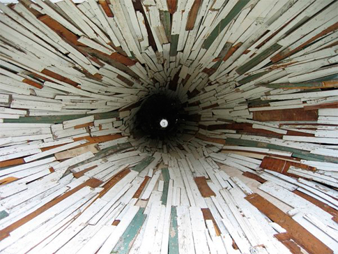
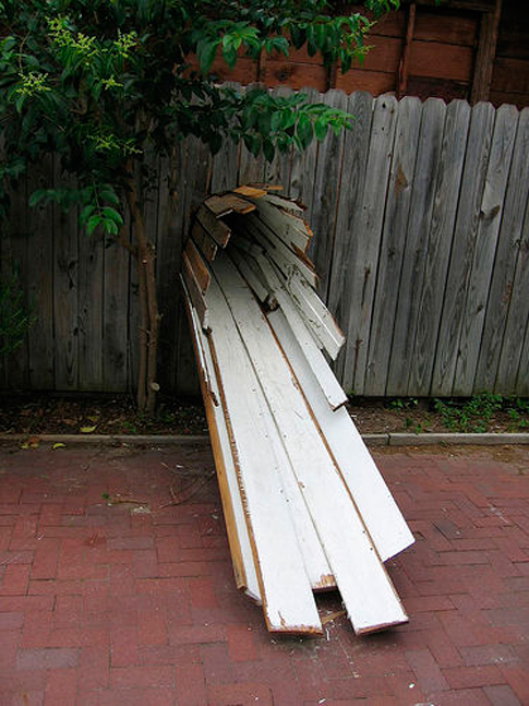
This transformation of two vacant houses about to be demolished by Dan Havel and Dean Ruck, Inversion (called Tunnel House by many people,) subverts the structure of a house. It was commissioned by Art League Houston back in 2005. Besides looking really good, the art/house served as a passageway through which one can literally travel, the lives of the people who lived there and their history re-formed.
Annotated Links
Annotated Links Still Life with Strawberries TPG10
Contemporary Artists using the structure of the Still Life:
Laura Letinsky (from Wikipedia) “Much of Letinsky’s work alludes to human presence, without including any actual figures. For example, in the Morning and Melancholia (c. 1997-2001), and the I Did Not Remember I Had Forgotten (c. 2002-2004) series, Letinsky seems to document the aftermath of a sumptuous gathering or dinner party. Faded flower petals intermingle with empty glasses and crumbs of food on partially cleared tables, often covered with a white linen that bears the mark of spilled wine. As alluded in the title Morning and Melancholia these scenes are often filled with a fresh, clear light, as though one is viewing from the perspective of the morning after, what the host failed to clean up the evening before.” There is a really great interview with her here.
Pat Hobaugh – oil paintings of still lives with sex objects
Emily Eveleth – paints almost exclusively jelly doughnuts. Yet they ooze with fleshyness, sexuality, and a tactility that draws you in like you’d never expect. from the catalogue for “All the more Real,” by Merrill Falkenberg:
“Eveleth has painted donuts for the past ten years. While there is something amusing in her choice to tenderly represent a seemingly inconsequential object, her program is more serious. She uncovers the donut’s corporeal qualities, rendering them so they become metaphors for our own bodies. Blood-red liquid encased in fleshy dough drips and oozes out of holes that symbolize bodily orifices or wounds. A blend between still life and portraiture, Eveleth’s paintings, the larger of which often include dramatic lighting and dark backdrops, incorporate a range of art historical references of Rubens, Rembrandt, and Caravaggio to Lucien Freud and Jenny Saville.”
Stephanie’s Links:
Odd Nerdrum – I always find this painter inspiring and deeply moving on a very human level. His writing on Kitsch is amazing, and I cannot believe so few people know about it.
Franco Mondini-Ruiz– I own one painting by Mondini-Ruiz, and I hope to buy more soon.
Colette – I love reading Colette and Isak Dinesen.
Dream Games: The Art of Robert Shwartz – This is one of my favorite exhibition catalogues. I wish the exhibition had traveled to Chicago where Shwartz was actually born. His paintings are so inspiring, I never tire of them. More of his work can be seen here.
Karen Kilimnik – this particular version of Karen’s work was my favorite iteration of it. The Serpentine, very picturesque in its April 2007 setting, was totally transformed by Kilimnik. Her vision permeated everything. Every detail was thought out and totally in place, in situ at the Serpentine. I was totally immersed in her work, and at the same time, completely able to laugh! Titles do matter, and very much so with Kilimnik. This exhibition was one of my favorite gallery experiences ever. Her work traveled to Chicago, later and it wasn‘t the same…. In the sterile cubic setting of the museum gallery, Kilimnik’s work seemed quaint, kitschy, and underserved. Every aspect of the architecture of the serpentine understood Kilimniks work, and in Chicago, every aspect of the museum, worked against her. I feel that most people who saw her work probably felt the effect of the huge empty gallery surrounding her small installed “room” as a negative space, literally and figuratively.
Emma Tooth – I found Emma’s work “Concilium Plebis” as I was looking for exhibition spaces for Modern Groceries. Her work is very contemporary, but also very traditionally grounded in skill and craft, much like Odd Nerdrum.
William Eggleston was the first photographer that I truly loved and whose work I continue to go back to over and over again.
Discussion
Still Life with Strawberries TPG10
Please use this space to comment on the project, the themes that this project addresses, and to contribute your point of view. We look forward to hearing from you.
Here’s what we’ve been thinking about and wrote to our subscribers:
We’ve reached double digits! How can it be that it’s taken us 10 issues to do a photograph? We’re not sure, but we are happy to finally bring one to you. What set Stephanie Dean’s “Modern Groceries” series apart for us was that her images go beyond their aesthetic allure to embody a subtle commentary on our lives in the age of foodism. As you can see, Stephanie’s “Still Life with Strawberries” – an archival print on Hahnemühle paper – doesn’t just look great it also gives you something you can chew on.*
These days our opinions about food have become intimately tied to our politics and identities. No matter your stance on the latest identifier – organic, free range, local, and now biodynamic – or whether you’re an occasional vegan or a die-hard meat eater, most will agree that now more than ever we are what we eat. So what does it say about us that our garlic spent weeks on it’s trek from China and that pineapples – once a sign of vast wealth – are available everywhere year round?
In some sense, we’ve succeeded in realizing the ideal portrayed in the Dutch still lifes Dean repurposes. The wealth and status their owners sought to project is common to us all. Globalization and industrialization has brought incredible variety to our diets. We love getting grapes year round. Mangoes are delicious. Tomatoes are a staple in our fridge no matter the time of year. However those tiny stickers on the tomatoes are emblems of their unforeseen consequences: environmental distress, energy wars, and an increasingly homogenized culture. Some might argue that we have more in common than we’d like to believe with the boston lettuce that innocently spends its entire lifecycle in a plastic package.
These conflicting issues, brought up so subtly in Stephanie’s photograph, were what drew us to her work. With the bounty of summer upon us, we hope they play in your mind as well, perhaps over a delicious meal. Happy Summer!
Best,
Oliver and Eleanor
*pun intended
Supermarket Still Life
contemporary art criticism photography Still Life with Strawberries TPG10
“Tell me what you eat, and I will tell you what you are.” -Jean Anthelme Brillat-Savarin1
As an omnivore, the human body can survive and maintain its health on an astounding array of diets. Our ideas about the foods we eat, however, are cultural. Until only the past few generations, eating habits and food cultures were passed down the generations by the shared meal experiences of families and social groups. The industrial farming practices and global shipping routes developed in the 20th century upended these evolutionary relationships, supplanting the ideological roles of mother and tribe with supermarket capitalism. Not only do agribusinesses provide the diverse foods we eat, they provide their own cultural context, communicating new memes of taste, health, and culture. In a critique of the marketing of industrial organic foods, Michael Pollen unpacks such culinary signifiers in The Omnivores Dilemma:
“Taken as a whole, the story on offer in Whole Foods is a pastoral narrative in which farm animals live much as they did in the books we read as children, and our fruits and vegetables grow in well-composted soil … “Organic” on the label conjures up a rich narrative, even if it is the consumer who fills in most of the details, supplying the hero (American Family Farmer), the villain (Agribuisnessman), and the literary genre, which I’ve come to think of as Supermarket Pastoral. By now we may know better than to believe this too simple story, but not much better, and the grocery store poets do everything they can to encourage us in our willing suspension of disbelief.”2
This disconnect between our ideals of food production and its practical realities is bridged by visual language. As the narratives are consumed, they produce comfortable illusions about the substance of our food, providing a false culinary wholeness, like a gastronomic Potemkin village.
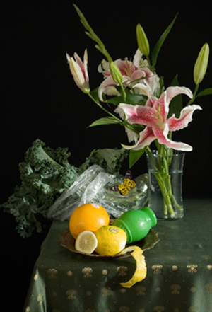
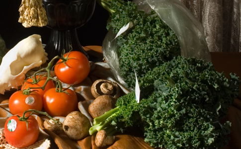
It is the cocoon of food packaging that envelops Stephanie Dean’s Modern Groceries series in contemporary consumer life. The photographs reenact Dutch still life master paintings from the fifteenth century, capturing the oblique soft light and deep shadows in saturated color. Objects are arranged with the same aesthetic fetish, displaying the bounties of the harvest and trade, as well as objects of curiosity, arranged perfectly askew over intricate linens and drapery. The produce, meats, and cheeses in the photographs are the same as their historical counterparts, but revealed to be modern industrial agricultural products by their packaging. Their presence subverts the bucolic ideals of the produce; the plastic is there to protect the food while it is transported globally and provides the surface where a plant can be re-branded into an emblem of the Supermarket Pastoral. The most visually subtle image in the series, “Still Life with Strawberries,” generates this subversion with only transparent plastics and a cluster of pricing stickers. An ironic disposable quality leaches from the packages, given their synthetic ecological permanence, in contrast to the finely crafted tableware and voluptuous produce.
By employing the visual archetype of the still life, Dean frames the work within the historical tropes of the Dutch master painting. The Dutch still life marked a shift in the visual content and economics of European painting in the fifteenth century. These canvases were commissioned by a rising merchant class, not the aristocracy or church, who had underwritten most previous art production. The merchant-traders sought depictions of what brought them power – goods produced by guilds or secured in trade – just as the aristocrats and popes commissioned works of religious, mythical or political authority that supported their ideological dominance. These paintings built a representative system that redefined the commercial products of the time into an ideal, much like the marketing techniques documented in contemporary grocery stores by Michael Pollan. Furthermore, the down-to-earth aesthetic of understated wealth on display in the paintings mirrors the criticisms of elitism and affluence frequently pointed at today’s progressive food movements such as Slow Food.
In this way, the Modern Groceries series can be seen as a critique not only of contemporary agricultural practices, but of the manipulative power of visual language. At the same time, the photographs delight in the pleasure of the food and the seductive beauty of nature and light. The images dwell in a cognitive disconnect of the sensory and the political – a feeling that many of us experience every week, as we push our carts down the aisles of our favorite grocery markets.
1 Jean Anthelme Brillat-Savarin, The Physiology of Taste, 1825
2 Michael Pollan, The Omnivore’s Dilemma: A Natural History of Four Meals (New York, USA: Penguin Group (USA) Inc., 2006), 137.
Brian Andrews is an artist who works with photography, video, and emerging media. Not content to just make things, he records as the west coast producer for Bad at Sports Contemporary Art Podcast. His critical writings can be found on Artnet and in Beautiful/Decay Magazine, as well as in numerous catalogs. Currently, he is the Course Director for the compositing program in animation and visual effects at Expression College for Digital Art in Emeryville, California.
Interview with Stephanie Dean
artist interviews Artist Interviews blog photography Still Life with Strawberries TPG10
Stephanie Dean was interviewed via Skype on May 13th, 2009 by Oliver Wise and Eleanor Hanson Wise of The Present Group.
Listen:
Introduction to Still Life with Strawberries
blog photography Still Life with Strawberries TPG10
Still Life with Strawberries is an edition of 50 archival photographs on Hannemuhle 308 measuring 9.5″x14″.
Stephanie on the Modern Groceries Series:
I am creating a series of still life photographs focusing on the way our purchased food is packaged and consumed. By setting common foods in their packaging and labeling direct from the grocery store into traditional nature mort compositions, our most common and necessary items of life – food – are jolted into historical focus. The viewers’ various degrees of knowledge of Dutch still life paintings will be the measure by which the photographs will either found or further the perceived rift between ourselves and nature, and ourselves and our food sources.
Bio:
Stephanie Dean attended the California College of Arts (San Francisco & Oakland, CA) where she received her Bachelor’s of Fine Arts in Photography. In 2005 she earned her Masters of Fine Arts in Photography from Columbia College, Chicago. Her photographic thesis was the body of work “?Boys/Men?” asking the question of when do modern boys become men. Her written thesis was on existentialism in Robert Frank’s The Americans. She has taught at Columbia College Chicago and is currently teaching the History of Photography at Oakton Community College in Skokie & Des Plaines Illinois.
Whoa – restricted access twitter art – a new arts funding model
blog collecting resources neat projects opportunities the exposure problem
The Brooklyn Museum has a Twitter Art Feed! Every month they welcome an artist to utilize twitter as a medium for their work. This is wrapped up as part of a benefit for their 1st fans program- where you get to go to parties and meet artists, skipping ticket lines and such. They call it a “socially networked museum membership.” So you get some of the benefits of being a museum member without the high price and free access to the museum. It is $20/year to join. I’m not sure how they handle the yearly resubscribing – do they just block people and then allow them again?
The part that seems so great to me is that people have to pay to see this twitter feed. And that is the only way that people are going to be able to see those artworks Now, it seems from their open call that the artists would be doing this for “exposure” which I do not like. I could be wrong about this, but there is no mention of money on the submission form at all. However I love this idea and it is really simple.
It does seem as though they’ve gotten some backlash for charging people to see their twitter feed. But I don’t think they are explaining it right. If they were giving money to the artists and it was clear that the money that people would be paying was giving them access to art and not just a twitter feed, then I think people would be more open to it. People pay $20 to get into museums all the time.
I came upon this through Maryann Devine’s smArts & Culture blog. She did an interview with An Xiao, one of their 1st Fan twitter artists. Xiao used the twitter space to think about the evolution of communication and the similarities between twitter and morse code. She tweeted in morse code for a month. You can watch a short video of her explaining the project below.
Go here for more info on 1st Fans.
TPG Interviews are now on iTunes
artist interviews blog internet making of talking TPG artists

Now you can easily stay up to date on our artist interviews, or explore our archives via iTunes.
LINKS
Archives
Lego Hello World
I wish all my printers were made of legos.
LIFE photo archive hosted by Google
Images from Life Magazine going back to 1860′s, hosted by Google
Coming Face To Face With The President
Well crafted story about an under-heard point of view.
In California, Pot Is Now an Art Patron
A new funding source for the arts – reaping big rewards and funding many projects. It’s pot.
Notes on Portraiture in the Facebook Age
Celebrity Book Club: A List to End All Lists
Because, well, it’s sortof awesome.
Are "Artists' Statements" Really Necessary?
The pros and cons about that nemesis for most artists.
This to That
You tell it what you’ve got and it’ll tell you what to glue them together with.
Work of art: Online store for buyers, sellers
Not the TV show! Kelly Lynn Jones from Little Paper Planes is interviewed on her project, gives us a cheat sheet to local affordable art resources.


