Happy Holidays!!

It’s been a year! Thank you to all of our initial subscribers, helping us get off the ground. 
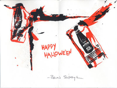
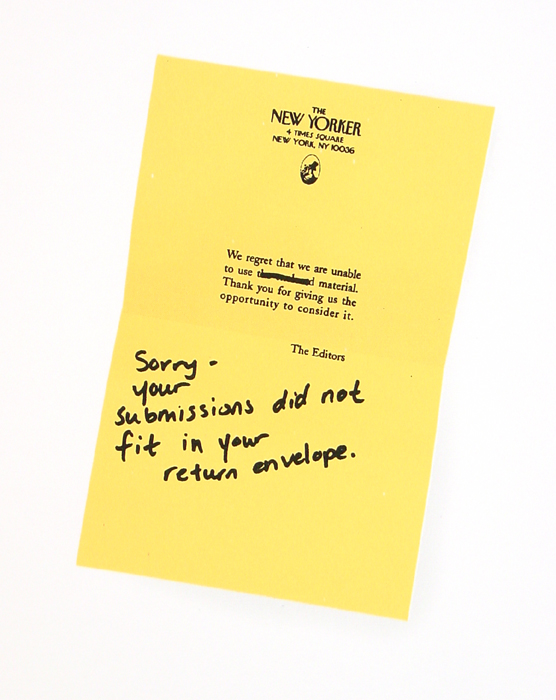
We’ve been getting great responses from TPG4. Since a few of our subscribers have mentioned how much they liked the images we included of Brian’s other failure series prints, I’m posting them here for everyone to enjoy.
 |
| Sorry, 2007 5 Colour Serigraph on paper (detail) Paper Size: 28″ x 22″ Image Size: 5 1/2″ x 8″ edition of 10 |
blog making of other quotes tidings
 I’m trying to get my act together over here, so rather than post all these things I have been thinking about for a long time individually , I’m going to slam bam you in one massive post.
First off, Happy Thanksgiving! I hope everyone’s was wonderful and looked as good as this. Scrumdillyumptious.
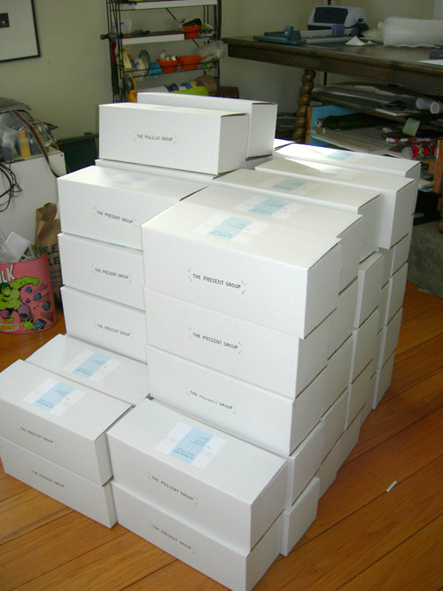
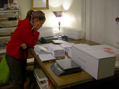
As most of you know, or are finding out any day now, #4 is out!! We are very happy to have ended an eventful year with Brian’s work. Here’s a peak at me doing a late night final edit of our letter to our lovely subscribers.
In our travels and travails around, we have come across a few things that I think are worth sharing.
Guerilla Sculpture spotted in Walnut Creek, CA- Sunday, November 18th
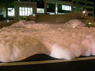
We just happened to come across this at the exact right moment, it’s peak. For a moment we didn’t understand or comprehend what was going on- it almost looked like snow, but it was advancing slowly towards us. For a moment while my brain was adjusting, I had a fleeting fear-unknowing, but then I was sooo happy. The bubbles were just billowing out and the wall of foam (at least a foot and a half tall) was slowly creeping across and covering the street. Pretty soon thereafter cars started whizzing through it, sending up huge blasts of “confetti” into the air, and trailing it all down the street.
This reminded me of an article I had been meaning to read for a while in Art Review Digital (Issue 16), entitled “What is Art for?” Here are a couple of quotes from it:
“[Artworks] help contruct my notions of what is possible, open new vistas of interest and have the potential to change who I am and what I think….What they do share is that there is a consequence to looking and thinking about them – a consequence that generates a possibility that was not there before, or was, at least, not available as a possibility to me…and has the potential to affect our social relations – how we choose to behave and what we choose to value.” -Charles Esche
“Art is the best tool we have when it comes to shattering our environment into an infinite number of imaginary tales, forms and space-times….What does seem clear is that art occupies a specific position in the city, and that this position is thus political: it incites its subjects to become active, to refuse the passive position the world of entertainment tries to foist on them. Entertainment places us in front of images to be looked at, while social formatting provides us with frameworks in which we must live. If artistic activity consists of putting these instruments and products back into play, then the observer’s task is, as in tennis, to knock the ball back into the other court.” – Niclolas Bourriaud
I found it interesting that both authors found the ulitmate purpose of art to be social, political. I’ve always liked art, and considered “good” art, anything that has had an affect, one way or another, on me. It is the challenge. A game. Bourriaud insinuates that it is the viewer that absorbs the new world and boundaries that the artist proposes by using that information to define and restrict that very world with new boundaries. Think of all the advertisements showing things floating in glass cubes floating in liquid years after Damien Hirst showed his first floating shark. So what is art for? It keeps the game going, keeps us moving forward.
Please use this space to contribute your thoughts and impressions of “Conversation”
You are also welcome to start a discussion relating to the work in any way.
Failure and Art
FAILURE RIDICULOUS TERRIBLE WONDERFUL :
A presentation of “video and performance based artwork exploring aspects of failure” put on at Park Projects in March 2007. “Failure Ridiculous Terrible Wonderful” was mounted in conjunction with the book Failure! Experiments in Aesthetic and Social Practices published by the Journal of Aesthetics and Protest Press . On their website (under Journal Press), you can purchase the book or read an introduction written, appropriately, too late for the publication deadline.
The Fable of Failure In Modern Art: An article written by professor Paul Barolsky in the Virginia Quarterly Review . It explores themes of the artist’s sense of self-doubt and anxiety and how it manifests itself in their work.
Cabinet Magazine, Issue 7- Failure: We heart Cabinet Magazine . One of their early issues, Issue Seven is a curated series of essays dealing with the theme of Failure. Scroll to the bottom part of the page and find links to many of the articles
Humor in Art
 Art:21, Season 2, Humor: This episode focuses on different aspects of humor in art through discussions with Charles Atlas, Eleanor Antin, Raymond Pettibon, Elizabeth Murray, and Walton Ford. You can watch much of the episode through lots of little segments on the site, otherwise you can buy the series or check it out of your local library. There is a little introductory bit by Margaret Cho. Art:21, Art in the 21st Century “uses the medium of television to provide an experience of the visual arts that goes far beyond a gallery visit. Fascinating and intimate footage allows the viewer to observe the artists at work, watch their process as they transform inspiration into art, and hear their thoughts as they grapple with the physical and visual challenges of achieving their artistic visions.”
“In Fitchburg a Marriage of Art and Humor”: A Boston Globe article about two Massachusettes artists, sculptor Ellen Wetmore and multi media artist Jeff Warmouth, who don’t hesitate to poke fun at the world around them, including subjects from the art world to lactation.
Lighten Up: Art with a Sense of Humor: The DeCordova Museum put on Lighten Up in 2001. “The 16 artists and artist  teams in Lighten Up rely on a number of types of overt humor: satire, self-deprecation, visual and verbal puns, black humor, the unexpected, the bawdy, the irreverent, and the ridiculous….By using humor, the artists break down a viewer’s resistance perform an end-run around conscious critical (and often dismissive) faculties, and create a receptive emotional climate for the delivery of impassioned, provocative, or subversive messages.”
Contemporary Printmaking
The London Art Fair website: The “About Prints” section has succinct and clear answers to questions like “What is an original print?”, “Why buy prints?” as well as a quick history of print-making.
Original Prints.com: locate original prints, limited editions, and multiples.
Alan Cristea Gallery: is the largest publisher and distributor of prints in Europe
Damien Hirst’s silkscreen print Sceptic
.
.
Links from Dewitt Cheng’s “Fellow Feeling”
Report on Resistentialism by Paul Jennings was originally published in The Spectator in 1948. “Things are against us”
Giorgio de Chirico was an influential pre-Surrealist painter. De Chirico is best known for the paintings he produced between 1909 and 1919, his metaphysical period, which are memorable for the haunted, brooding moods evoked by their images. At the start of this period, his subjects were still cityscapes inspired by the bright daylight of Mediterranean cities, but gradually he turned his attention to studies of cluttered storerooms, sometimes inhabited by mannequin-like hybrid figures.
HANDLING:
Gently remove your print from the box and separate it from the foam. Use two hands when handling the print, as creases in the paper are hard to remove. You may leave it in the plastic to protect the paper from the oils on your hands. Lay the print down on a smooth surface. Use smooth weights, like books, on the four corners of the piece to flatten. Once it’s mostly flattened, turn the print over and weight it again until flat.
STORAGE:
If unframed, it is best to keep it in a cool, dry, dark place on a flat surface in contact with acid free materials.
FRAMING:
If you are going to frame the print, here is an explanation of the different elements you’ll encounter.
The Frame:
Made of wood or metal, the frame is the support system for the work of art. The larger the piece, the more substantial the frame should be, since the weight of the glass and other materials are heavier. When going to a custom frame shop, the frame is usually the most expensive part of the process. This is because each frame is built specifically for your artwork, and many of the mouldings are hand-crafted and/or finished. There is no shame, however, in buying and using pre-joined frames, as long as they are strong enough for your size artwork. You can find these in many art supply stores and craft stores, or you can get used frames in thrift stores or antique shops. Another option is to buy a frame with a poster or print already included, like the ones sold at stores such as Target and TJMaxx. Just remove the artwork, use the frame for your new work, and you’ll still save more than getting a custom job. Also, at craft stores like Michael’s you can buy kits with sets of two frame legs, so that you can easily build your own custom sized frame.
Continue Reading »
contemporary art criticism TPG4
A few years ago I became aware of resistentialism, that parody version of existentialism propounded by humorist Paul Jennings in 1948, and subsequently explored by Thomas Pynchon, that reveals that inanimate objects have it in for us: “Les choses sont contre nous” — “Things are against us”. The English author Terry Pratchett cites one example: “the tendency of garden hoses, no matter how carefully one coils and stores them, to unloop themselves overnight and tie the bicycle to the lawnmower.” Anyone who has struggled with balky objects knows the poetic and prosaic truth of this. We are all Laocoon (the Trojan priest seized by the serpent) afflicted by the gods.
The animistic notion that objects have a life of their own is the basis of primitive religion, of course, and the magical sense of reality is something all young children know, their rationality-stupefied parents able to share that enchantment only vicariously. It is verified and expressed in art sometimes, as in Chirico’s metaphysical still lifes – with their children’s toys, draftsman’s tools, antique statuary, and even indeterminate objects lingering in deserted Italian piazzas as evening falls. Scientists, too, incline toward viewing life and sentience from a wider, trans-human perspective: the earth is an intricate living organism, just as the “primitives” told us all along.
The humorous, deadpan prints of Brian Stuparyk provoke such wry musings about the interaction between human and other (i.e., ostensibly inanimate) life. His beautifully executed photo-silkscreens depict the unseen, unremarked stuff of daily life —a band-aid, a lottery ticket, a fortune cookie, the umbrella from a tiki bar drink, popsicles- in the bright, shadowless lighting that we recognize from advertising. The colors glow almost preternaturally with incandescent longing; they demand to be consumed, like the foods in Wonderland (“Eat me”, “Drink me”). In these works, however, the objects of desire, though, are affectionately humanized and imperfect: they’re used, they’re remnants – leftovers: a cigarette butt, an empty condom package, an Second Place ribbon, a rejection note, crumbs, puddles.
 The artist calls these images, which take Pop Art’s love of the commercial vernacular and replace its determined democratic iconoclasm with an amused affection for the invisible artifact as a kind of human surrogate. He looks askance at a hyper-competitive society of self-declared strivers and winners: “In my work, failure is as important as success. My subjects are tokens of life’s little defeats, everyday failures, impossibilities and things that don’t necessarily need to be celebrated.” Each print is a “keepsake of failure, unrequited love or losing struggle.” Given that most of us lose more often than we win, a certain wry humor about oneself seems an eminently reasonable and sensible attitude toward quotidian life with its thousand natural shocks.
Stuparyk studied photography in Canada and printmaking at Cranbrook Academy in Michigan. He has taught in Ohio and Michigan, has exhibited nationally, and is currently Artist in Residence at John Talleur Print Studio in Lawrence, Kansas.
.
.
.
.
DeWitt Cheng is a San Francisco artist and freelance art writer for Artweek, Art Ltd., SanFranciscoArtMagazine.com and Shotgun-Review-com. He curated “Hybrids” at the Peninsula Museum of Art in 2006 and is co-curator the Meridian Gallery’s 2008 “The Art of Democracy” show. He will be teaching Contemporary Art Theory and Criticism at UC Berkeley Extension, San Francisco, in the spring of 2008.
artist interviews Artist Interviews others lives TPG4
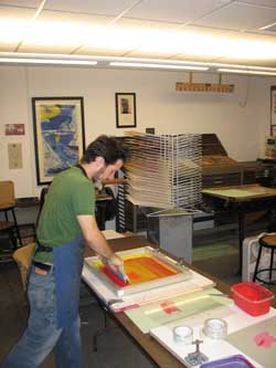
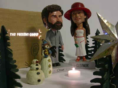
Brian Stuparyk was interviewed via Skype on November 16, 2007 by Oliver Wise and Eleanor Hanson Wise of The Present Group..
.
Part 1 where Brian talks about the themes of authenticity and value in his art, a bit about his educational history (or lack there of) in art, and the Call to Entry that kick-started the Failure series: A show put on by Chester Costello entitled, “Something to do with Failure.” We also discuss how the process plays into the creation of his works and how these works interact with a viewer.
.

.
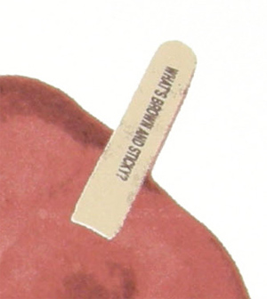
Part 2 where we talk about his failure series, failing at failure, and the future: Trying, succeeding, and still failing. We talk about his experience at Cranbrook (“What does it mean to be an artist today? Failure and debt.”), his letter to Eric Fischl, more about “Conversation” as well as what’s brown and sticky.
Listen:
 Interview with Brian Stuparyk - Part 1 [14:04m]: Play Now | Play in Popup | Download Interview with Brian Stuparyk - Part 2 [12:55m]: Play Now | Play in Popup | Download
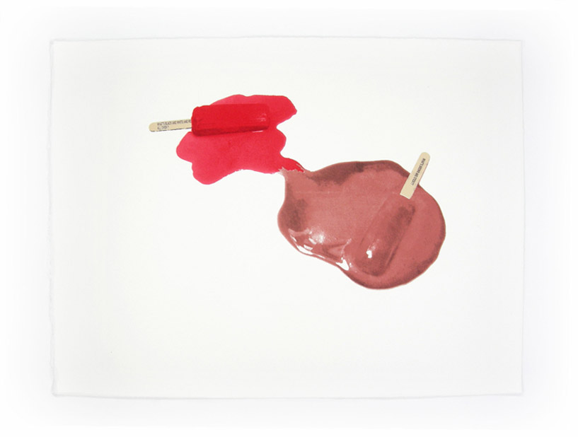
“Conversation” is a 6 color silkscreen print on Arches 88 by Brian Stuparyk.

Brian Stuparyk is a silkscreen printmaker whose prints showcase mementos of the individual pursuit of elusive personal happiness. In his work, failure is as important as success. He depicts tokens of life’s little defeats, everyday failures, impossibilities and things that don’t necessarily need to be celebrated. Although great time and care is taken to faithfully reproduce these objects, they remain by their nature disappointing.
.
Stuparyk on “Conversation”
“I like to talk. Because it lets other people know how I’m feeling.” From: Notes On The State Of Virginia by Drakkar Sauna from the Album drakkansasauna
There are no strangers. This I have learned from having moved roughly every three years of my life and meeting an incalculable amount of people. A member of the general public is receptive to talking (at least for a moment) to almost any other, depending of course on circumstances. The key to this is that the odds of you approaching a total stranger are much greater than those of you being approached by one.
It has been said that while in school Bill Clinton never had any problems picking up any woman he wanted because he was such a good listener. Listening is much easier than the actual talking part of the conversation, yet often one of the parties does not maintain the roughly 50:50 talking-to-listening ratio that balances a one-on-one conversation. Or worse yet, often neither party listens – they just talk.
In Conversation, the two popsicles are, as suggested, conversing. However, they are only talking in vague terms to each other, and only about themselves with their thoughts meeting in the middle of the page. Each is so wholly involved in worrying about their problems, they have neglected everything else that is happening, including the fact that each is slowly melting into a puddle.
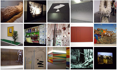
Almost as good as the real thing. Anu Vikram, critic for TPG3, posted photos from her whirlwind tour of this year’s Venice Biennale.
Xiem Gallery in Pasadena has put on a ceramics show with the theme of Skin. Juried by Paulus Berensohn, and chosen from over 400 entries, Presley Martin (TPG2) has two works in the show.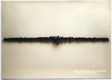
The show is up from October 13th – November 24th, 2007.
Gallery: 1563 North Lake Avenue Pasadena, CA 91104
Hours: Tuesday- Friday 10am-6pm, Saturday 10am-5pm
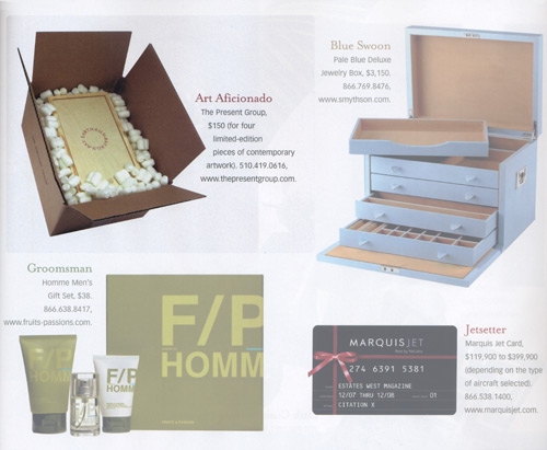
The Present Group is featured in Estates West magazine’s holiday gift guide. We’re one of twenty Glam Gifts “that won’t wind up collecting dust in the back of Millie’s closet.”


Here’s a link to photos from Ethan’s Anthroptic show at PS122 Gallery in New York:
“I always think that art, on top of the thing that you are looking at, is a sortof occasion to have a discussion about whatever it is that the art brings to bear, or to light rather.”
-Scott Oliver from An Interview with Scott Oliver and David Lawrence by Frank Prattle from Neighborhood Public Radio

We had an intimate night of art, food and conversation. It was great fun and delicious. Thanks to Svea at Swarm and to all those who came out to share in the goodness.


We spent the day meeting and talking with a whole host of great people. We’ve discovered that the most successful way to explain our project is one-on-one, so the Expo was a perfect opportunity. We encourage all the artists we met to submit proposals before November 1st.


Lego Hello World
I wish all my printers were made of legos.
LIFE photo archive hosted by Google
Images from Life Magazine going back to 1860′s, hosted by Google
Coming Face To Face With The President
Well crafted story about an under-heard point of view.
In California, Pot Is Now an Art Patron
A new funding source for the arts – reaping big rewards and funding many projects. It’s pot.
Notes on Portraiture in the Facebook Age
Celebrity Book Club: A List to End All Lists
Because, well, it’s sortof awesome.
Are "Artists' Statements" Really Necessary?
The pros and cons about that nemesis for most artists.
This to That
You tell it what you’ve got and it’ll tell you what to glue them together with.
Work of art: Online store for buyers, sellers
Not the TV show! Kelly Lynn Jones from Little Paper Planes is interviewed on her project, gives us a cheat sheet to local affordable art resources.