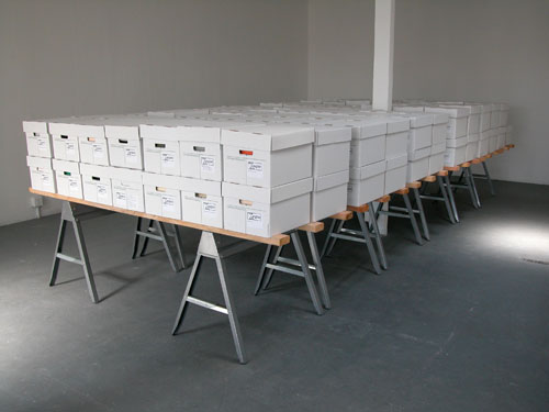
Anthroptic in Australia!

presenttense

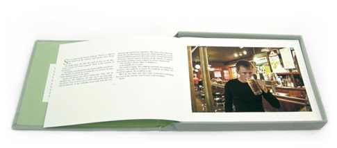
Our very first piece, Anthroptic by Ethan Ham and Benjamin Rosenbaum, has made its way into the permanent collection of Australia’s National Portrait Gallery and is being shown in “Present Tense: An Imagined Grammar of Portraiture in the Digital Age.”  Technical Curator Michael Desmond introduces some of the ideas behind the Portrait Gallery’s winter (or summer here) exhibition:

The National Portrait Gallery exhibition Present Tense: An imagined grammar of portraiture in the digital age considers the alliance between portraiture and technology and investigates how different ways of imaging reflect how the individual is perceived as well as how the various mechanisms of imaging that are used to manipulate that perception. Present Tense includes examples of the informal and immediate digital snapshots made with mobile phones; images recorded with sonograms that reveal faces that cannot be seen by the unaided eye; 2D and 3D portraits generated exclusively from binary code; and the more expected videos and manipulated photographs.

istvan

It is a wide ranging show, with works from Justine Khamara, Julian Opie, Rineke Dijkstra, and Loretta Lux among them.  Maybe the cast of “Work of Art” should have taken a trip to go see this show before their less than stellar look at portraiture in their first show.

The show will be up until August 22nd for anyone visiting Parkes, Australia this summer!

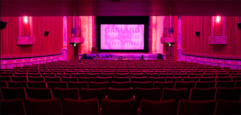
What to do: Oakland Underground Film Festival: Local Shorts Showcase

It’s FREE! It’s easy to get to! There’s fun eating and drinking places around!

With short films ranging in subject matter from Narcolepsy to Eating to Disasters in 2087, it is sure to be entertaining.

filmfest

OAKLAND UNDERGROUND FILM FESTIVAL
FRIDAY JUNE 18th – Local Shorts Showcase
Doors open 7:30PM – Films 8:30PM
FREE ADMISSION

Films:
elfmädchen Dir. Mirka Morales 16 min
PAISLEY’S TALE Dir. Harmony Nichol 9 min
DOWN ON THE FARM Dir. Alfonso Alvarez (6 min)
POPP Dir. Imelda Picherit 2 min
LAUNDRY Dir. Danielle Katvan 4 min
OSA: OAKLAND’S GEM Dir./Prod. Jenny Chu 15 min
ROUGH DEMO Dir. Donte Harrison AKA Dr. Cyclops (4 min)
INHUMAN EATING MACHINE Dir. D. Silva (9 min)
WASTELAND Dir. Kathleen Quillian (3 min)
TRADITIONAL INDIGENOUS VALUES Dir. Ruth Villasenor (8 min)
GOLLY THE RAINMAKER Dir. Yoram Savion (6 min)

Biz Ladies: Hiring Interns" class='title'>Biz Ladies: Hiring Interns

A great article (especially the end part that Grace writes) about hiring, working with, and planning for interns in your business.

Displaying works on Metal or Glass

Matthew Cella shares his favorite ways to display works on metal or glass:

shelf

Place it on a small shelf
This is my favorite way to show metal pieces. Take a thin, 4” x 12” piece of wood and wrap it in white felt. Attach 2 small brackets to the bottom of the shelf and install it on the wall. Then lean the art on the shelf against the wall. Although the piece is not heavily protected, this display method enforces the physicality of the piece, and offers it for further investigation by the viewer.
All of these materials can be found at your local hardware and fabric stores.

standoffs

Mount it on a wall with Stand-Off hardware
This is the most modern way to display the art, and is found mainly in the commercial sign business. Stand-Offs are hardware that space the piece off the wall and hold it into position. There are many different kinds of Stand-Offs available, but the preferred type is one that just grips the edge of the metal, without having to drill holes.

Sources (We in no way endorse these companies or receive compensation for these referrals):

Frame Pegs:
http://www.unitedmfrs.com/cart/detail.cfm?item=4833
http://www.framepegs.com/Pricing/pricing.html

Edge-Grip Stand-Offs:
https://www.novadisplaysystems.com/basket.aspx?product=277
http://www.dkhardware.com/product-5653-eg38bs-brushed-stainless-edge-grip-for-3-8-material.html

If anyone has additional sources, please leave them in the comments!

Annotated Links: Matthew Cella

Game Influenced Art, Digital Interventions, Boy Culture Art

rosscampbell

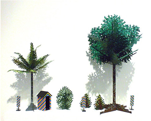
Ross Campbellpixelated ceremonial masks, bit type, and digital flora.  I think he and Matt might be art cousins.

Andrew Venell – an artist working with the chaos of information, social anxieties, and the digitally mediated world we live in

Takashi Murakami -  video games, boy culture, super flat, and tons of color:

Murakami’s style, called Superflat, is characterized by flat planes of color and graphic images involving a character style derived from anime and manga. Superflat is an artistic style that comments on otaku lifestyle and subculture, as well as consumerism and sexual fetishism.

Tony Bechara – abstract, almost color-field paintings all done in small pixels.  They vibrate your eyeballs.

colinhenderson

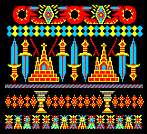
Colin Henderson – clearly influenced by the 8 bit aesthetic, this UK designer creates patterns and illustrations/collages

Cory Arcangel – a artist/programmer who performs actions and interventions in photoshop, in video games, on websites, and within the art context in a playful manner

Pixel,  is an insightful short documentary by Simon Cottee that explores the world of pixel art, animation and chiptune music.

Code is the New Craft by Mike Bianco

As both a curator invested in contemporary art practices, and as a potter of almost twenty years, I often find myself asking “What does ‘Craft’ mean anymore?” Craft is often considered a four-letter-word in the “big A” art world, and relished in the neo-DIY movement, but is rarely theorized anymore in relationship to our current cultural climate. As a result, I often find myself musing about the two supposedly disparate practices of “High Art” and “High Craft” and the aesthetic interconnections between them. Whenever confronted with this dichotomy I return to the seminal craft philosopher Soetsu Yanagi and his analysis of art and craft in his book The Unknown Craftsman.
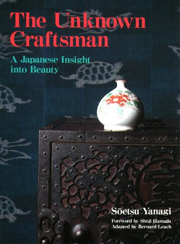
theunknowncraftsman

For Yanagi – the founder of the Japanese Arts and Crafts, or Mingei movement, of the early 20th century – hand-crafted objects were the way to re-connect industrialized society with the natural world. First published in English in 1972 during the birth of the microprocessor, the book’s chapter Pattern formulates Yanagi’s manifesto: How pattern is derived, what constitutes both a good and bad pattern, and the ability for pattern to provoke in man a full capacity to perceive the beauty of the natural world. His argument is hinged on the question: “Why have painting and pattern separated? The same cause underlies the idea that divides art and craft: the growth of individualism.”

Yanagi’s question is based on the notion of a “Viewpoint,” a human perspective that allows the artist to distill the beauty of nature into a more refined pattern. When using the example of translating a bamboo leaf into a “mon” – or Japanese crest-  Yanagi creates his theory of pattern based on some of the following principles:

*A pattern is both true to nature and artificial.

*Pattern is nature plus a human viewpoint, and the viewpoint is what
gives content; All patterns are products of a viewpoint.

*Good pattern is frequently rather terrifying. And any good pattern has
an element of the grotesque.

*Pattern does not explain; it’s beauty is determined by the viewers
imagination.

This theory of pattern underscores Yanagi’s entire philosophy of beauty, and articulates his perceived division between art and craft, individualism and collectivism. However, this system of pattern creates a problematic condition for both contemporary pattern makers and painters alike. Yanagi’s model for pattern production is fundamentally productive except for the variable value of the viewpoint. Yanagi’s post-industrial viewpoint has been diminished; our new viewpoint is post-digital.

For most inhabitants of the “developed” world, the simulacric lens of the computer, where all nature is synthesized into a simulation, has become the new viewpoint. Rivers have been traded for iPhone aps, expeditions for Google Earth, and communal banquets for cocktails in Second Life. And the basis of this digital sublimation is the highly skilled craft of code.

Emerging in 1801 from Joseph Marie Jacquard’s binary punched card loom, computer code has become the densest language mankind has invented to express the narrative of the world. Through it’s abstract syntax and consortium of disjointed symbols, code has created the algorithm to translate reality into a fragmented arena of spectacle that is as thin as a computer screen and as vast as the surface of the globe. If language precedes perception, then code has certainly shifted the “viewpoint” from the natural to the digital.
comparison

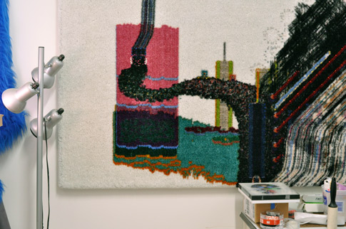
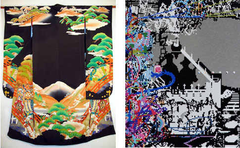
There is a new generation of artists and pattern makers engaging the structure of pattern from the post-digital viewpoint: Matthew Cella is one of them. Cella, like Yanagi, is nostalgic for the past; for the nature of his youth. The difference is the nature of Yanagi’s childhood is of rice paddies and Mt. Fuji, while Cella’s is comprised of similar subjects represented in the synthetic landscapes of Atari, Nintendo, and Sega. And what Cella does with digital nature is in practice no different than what Yanagi describes in the translation of an actual bamboo leaf into a pattern; he refines it into something more than the original could be. Furthermore, Cella – like Yanagi’s own desires -employs his patterns into utilitarian forms such as rugs. But the question remains: How, if at all, is Cella’s work bridging the craft/painting divide?

As programmer Charles Petzold states in Beautiful Code: “Code is just a smart kind of data – data designed to trigger processors into performing useful or amusing acts.”  One could almost think of this statement in terms of weaving: code is the craft of weaving itself, and the useful act which once produced blankets and baskets, now results in the infinite cloth of pixels that our eyes scour for information. And although Yanagi saw the technological as the bondage of mankind, in what way is this ever increasing craft of code – and all of it’s resulting patterns of pixels – creating a new utilitarian form, new unknown craftsmen, and bringing us together in ways Yanagi had originally only thought possible through our interactions with ceramics and textiles?

In many textile traditions, landscape and narrative are literally woven together through the production of pattern. The socio-technological changes of our world have shifted our forms of representation, transforming our sense of landscape-narrative from the geographic to the sociological. Landscapes and histories have been replaced by networks and communities founded on the craft of code. Perhaps Cella is presenting textile traditions in a new way. Each pixel of Cella’s work represents a collaged fragment of information. It is as if he has cut up the narrative textile traditions of the Pueblo, Celts, and Akan, and haphazardly stitched them back together with the digital pop-culture of the 1980s: The result is the fragmented quilt of the post-modern world.

I wonder what could be gained from a more comprehensive melding of the arts and crafts with digital production? Perhaps Comp-Sci programs could be more experimental within arts and crafts institutions rather than liberal arts colleges and poly-technical schools. Could dot-coms be more productive if they established micro-potteries and looms for their employees rather than ping-pong tables and bi-weekly office parties? In addition to programs such as Google’s local produce initiative, could companies find a qualitative improvement in their employees and product by supporting local artisanal practices? If we accept that our lives have become chaotic and fragmented – largely due to the digitization of our reality – then the incorporation of the ephemerally digital with the haptically crafted seems like a very interesting path to follow.

.

Mike Bianco is an independent curator and artist based out of Marfa, Texas, and is the recently appointed associate curator at Ballroom Marfa. Prior to moving to Marfa, Bianco was the co-founder of Queen’s Nails Projects, an offshoot of Queen’s Nails Annex in San Francisco. In addition, Bianco is also the founder of the alternative arts space The Waypoint, in Marfa, Texas. More recently, Bianco has been focused on developing his projects The California Arts Cemetery in Lone Pine, CA., and a contemporary ceramics residency in Marfa, Texas. For more information about Bianco and his work you can visit www.biancoprojects.com

Interview with Matthew Cella and Studio Photos

This interview was recorded on May 16th in Cella’s studio in San Francisco.

 
icon for podpress  #14 Interview with Matthew Cella [52:38m]: Play Now | Play in Popup | Download

In this interview we mention:

Jeff Koons
Marcella Faustini
Rob Burden
Tom Friedman
Takashi Murikami
Takeshi Murata
Devendra Bernhart

STUDIO TOUR!

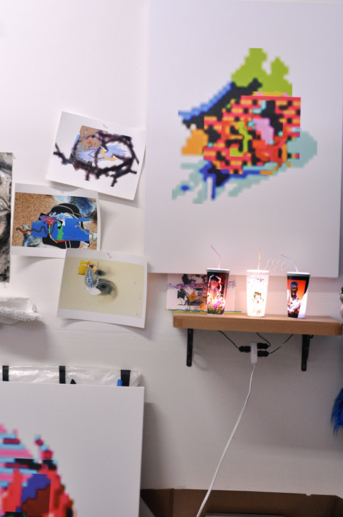
studiocupssm

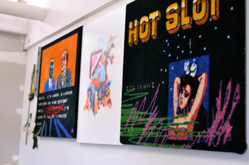
carpetssm

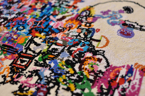
crossstitch-det_sm

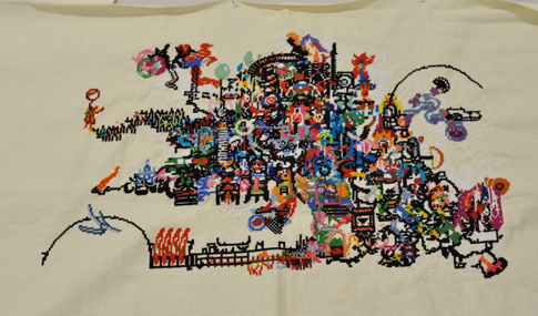
crossstitch_sm

2metalworkssm

carpet2sm

plexi2sm

Introduction to Map(256+128)3

tiltfocus

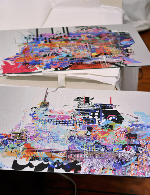
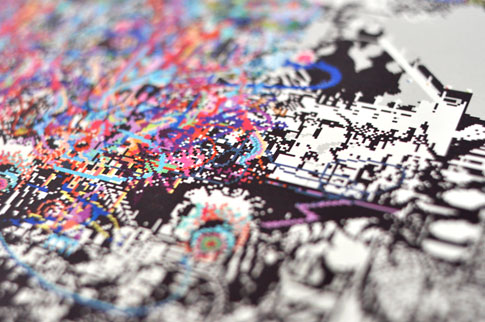
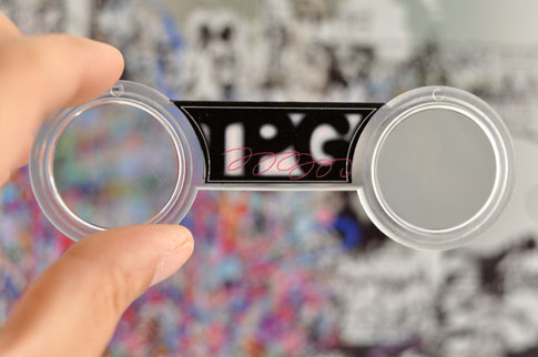
Map(256+128)3 is an edition of 69 UV prints on brushed anodized aluminum accompanied by 3D viewing glasses.  Created by Matthew Cella, Map(256+128)3 presents a densely colored pixelated landscape that reveals a hidden multi-layered, twinkling world when viewed through the glasses.  There are five “golden tickets” within the edition; they are printed on a golden aluminum alloy instead of the regular silver.  The recipients of these five are subject to another treat from the artist.

holdingglasses_485

Matthew Cella fabricates multi-media works that are the product of digitally collaged .;::’til;ps and //??>s. Born in 1981, he received his MFA from the San Francisco Art Institute, and currently lives and works in San Francisco.

Quotes: Susan Medak

twThis quote was found in the Berkeley Rep program for In the Wake by Lisa Kron, which, incidentally, is one of the best plays I have seen in some time.  Go see it!
Chad Jones sat down with Susan Medak on her 20 year anniversary as Berkeley Rep’s Managing Director.  This quote resonated strongly with us because we think along the same lines about the work we produce, the context we provide, and the subscribers that provide the support for it to all happen.

Why do you think you and Berkeley Rep have worked so well together?

“If we have been successful, it’s been in part because we produce what we care about, and what we care about turns out to be an aesthetic that is shared by our community.  This formula wouldn’t work in every community.  We’re in Berkeley, in the Bay Area, and that gives us a certain license to do the kind of work we do.  We have taken responsibility for building an audience and bringing that audience along with us.  We’ve taken a lot of responsibility for helping audiences enjoy the work as much as we do.

Context is all- and that’s my philosophy about everything.  The more context we can provide, the richer the audience’s experience.  Our audiences are intelligent and thoughtful, and we have a lot of respect for them. “

Chinese Concept Train

That doesn’t have to stop at stations!

Repeat x Repeaty" class='title'>Repeat x Repeaty

Free patterns for your digital world. Fun!

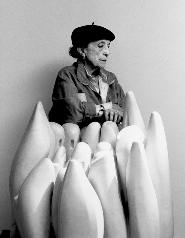
Louise Bourgeois dies at 98

louise_bourgeois

She will be missed.

Obituary
Works and Videos at SFMOMA
Art:21 episode
Slideshow of works
Kiss of the Spider Woman: Remembering Louise Bourgeois
Louise Bourgeois: a web of emotions

The Results are In!

After a very tight race with the highest participation rate yet, the winner of this year’s Subscriber’s Choice Voting is Nava Lubelski!  Congratulations and thanks to all.

tequila_sunrise

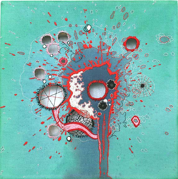
Nava Lubelski was born and raised in NYC and is living currently in Asheville, NC. Her work explores the contradictions between the impulse to destroy and the compulsion to mend. She scrambles expressions of aggression with masochistic patience and sublimation and she plays with the feminine through the graphic form of the “stain” and lace inlays.

Lubelski’s work has been shown at the Museum of Arts & Design, the Weatherspoon Art Museum, the Queens Museum of Art, and in galleries worldwide.  She was a featured artist in the book Contemporary Textiles: The Fabric of Fine Art, 2008 and she has received grants from The Pollock-Krasner Foundation and the New York Foundation for the Arts.

Two Feel-Greats Before The Weekend

A baby hears his mothers voice for the first time after ear surgery, and a cop makes a new friend.

The Profession Project" class='title'>The Profession Project

Michael Zheng interviews his fellow classmates 5 years after their MFA.  He looks to find out what has changed for them, how they make a living, how they view art and the artworld.

in some places, summer is coming

fog
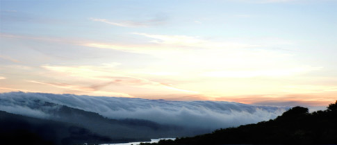
But here we layer up and watch fog tsunamis take over the earth in slow motion.  It’s sortof awesome.

Walklets by Rebar" class='title'>Walklets by Rebar

Working off of their success with PARK(ing) Days, Rebar has designed some modular units to easily add pedestrian space to the sidewalk/streetspace.

Reading List: Picturing the Art World Infrastructure

tercerunquinto
New Langton Arts’ Archive for Sale: A Sacrificial Act by Tercerunquinto (a collaborative group), 2008

Thinking about new models of funding and new ways that the art world could work is not new.  But recently, whether because the economic climate has forced us to rethink our methods, or simply because it’s time in some larger cycle, there has been not only a birth of new models of funding art projects, but also a lot of writing and energy about it.

Part of this effort is simply to understand what is happening now and in the past.
The Art Spaces Archive Project is a non-profit initiative to help preserve, present, and protect the archival heritage of living and defunct for- and not-for-profit spaces of the “alternative” or “avant-garde” movement of the 1950s to the present throughout the United States.
The California Cultural Data Project is an online data reporting system that was created to produce a variety of reports designed to help increase management capacity, identify strengths and challenges and inform decision-making for California’s Cultural Institutions.

But the other part is writing about and archiving what is being borne out now.  This is a list of some of the writing I’ve come across in the past month that works towards an understanding of how the funding mechanisms are changing in the art world, envisions how it could be, and starts to catalog the new efforts and models that are emerging today.

How Things Work by Aimee Le Duc, Art Practical
Part 1, Part 2, Part 2 cont.
Le Duc investigates the trajectory of more established art spaces in SF, their success or failure, and follows up with a look at new spaces/organizations are utilizing hybrid models of funding and programming.

A Catalog of Strategies, Proximity Magazine #7, Summer 2010
The Catalog is a special annotated directory of inspirational groups, organizations, projects, and individuals from around the world. With over 350 entries the directory features the best practices and celebrated failures of interventionist art practitioners.

Survival Strategies for the Arts, on Blue Avocado, 2009
Though aimed at non-profits, the thinking behind these strategies applies to everyone.  John Killacky, artist and arts funder, not only knows that we need the arts now more than ever, but gives us ten survival strategies for arts organizations and one for audience members — and reminds us that all of us are audience members.

Project Space Survival Strategies:  a research project by the artist Elysa Lozano for Autonomous Organization, produced in collaboration with Invisible Venue.  I found this idea especially striking: “The motivations behind these initiatives are inextricably linked to the manner of funding them. What constitutes an acceptable way to get funding is as much a question of the integrity of the intention as it is a question of survival.”

Art Infrastructure, cmagazine 103, Autumn 2009
A bunch of articles discussing exhibition strategies and platforms that provide alternative models for how art is exhibited and experienced by its viewers.  If we take the idea from Lozano (above,) then these alternative models would inevitably be thinking of new funding models as well.

Amanda Wachob Tattoo" class='title'>Amanda Wachob Tattoo

Something different with tattoos.. Conceptual tattoos, Brush stroke tattoos.   Very nice

How big is the Deepwater Horizon oil spill?" class='title'>How big is the Deepwater Horizon oil spill?

It’s big.  Use this map to compare it to lands we know and love.

« Previous PageNext Page »

Web hosting that supports artists.

Archives

  • TPG21
  • TPG20
  • TPG19
  • TPG18
  • TPG17
  • TPG16
  • TPG15
  • TPG14
  • TPG13
  • TPG12
  • TPG11
  • TPG10
  • TPG9
  • TPG8
  • TPG7
  • TPG6
  • TPG5
  • TPG4
  • TPG3
  • TPG2
  • TPG1

Lego Hello World
I wish all my printers were made of legos.

LIFE photo archive hosted by Google
Images from Life Magazine going back to 1860′s, hosted by Google

Coming Face To Face With The President
Well crafted story about an under-heard point of view.

In California, Pot Is Now an Art Patron
A new funding source for the arts – reaping big rewards and funding many projects.  It’s pot.

Notes on Portraiture in the Facebook Age

Celebrity Book Club: A List to End All Lists
Because, well, it’s sortof awesome.

Are "Artists' Statements" Really Necessary?
The pros and cons about that nemesis for most artists.

This to That
You tell it what you’ve got and it’ll tell you what to glue them together with.

Work of art: Online store for buyers, sellers
Not the TV show!  Kelly Lynn Jones from Little Paper Planes is interviewed on her project, gives us a cheat sheet to local affordable art resources.

How to make a Daft Punk helmet in 17 months
whoa.