The Sparkle Effect by Sarah Hotchkiss

Do you have a happiness role model? Think about this question. Do you actively pursue happiness in a systematic way such that you have identified someone who appears to lead an optimistic lifestyle you aspire towards? Christine Wong Yap has. Ask Christine for her happiness role models and you will receive an instant reply: Henry Winkler and Maira Kalman. You may remember Winkler from his decade-long role as “The Fonz” on Happy Days. Maira Kalman is the prolific illustrator and author of such books as The Principles of Uncertainty and The Pursuit of Happiness. And yes, they both have affiliations with the word ‘happy.’

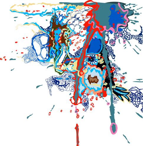
Happiness, that often-unattainable life goal, is one of Christine’s central artistic concerns. Her artworks address optimism, pessimism, the pleasures of mundane materials, and transparency of the creative process. For the Present Group’s Issue #21, she created an extra-large sticker sheet: a screen print on cut holographic vinyl. The mirrored images are a festoon, a conglomeration of ten blank ribbon banners resembling packaging flourishes or “I ♥ MOM” tattoos. Underneath black and transparent cyan ink, the fractured reflective surface is dynamic and transfixing.  To achieve maximum sparkly effect, either it or you must move. This is highly recommended.

When I was a child, I had a fairly substantial sticker collection. They were modest, solid colored stickers of the farm animal, flower, balloon, and heart variety. I periodically sifted through the full to semi-full sheets, checking my inventory, hoarding the tiny adhesive symbols. I deferred gratification indefinitely. No art project or birthday card was ever good enough for a sticker from my collection. The thought of sharing them or using them never crossed my mind.
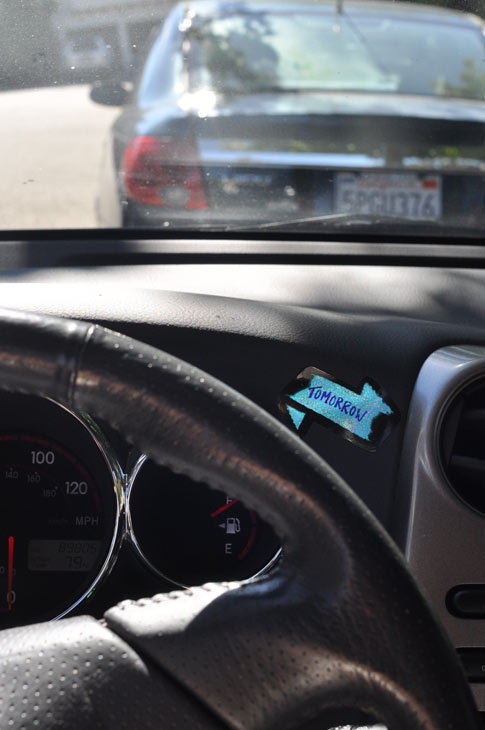
Two decades later, faced with Christine’s Present Group piece Ten Banners for Home and Office, I have a very different impulse. I want to peel the banners from their paper backing and stick them everywhere. I want to use them as labels, pronouncements, and notices. I want them on notebooks, newspaper boxes, and a card to my best friend. I realize now any sense of loss I might feel from the initial removal of a sticker from my possession will be more than countered by the cheer it will eventually bring both me and others. Instead of preserving the sticker sheet as a whole, I want to test the sticker’s ability to dazzle me for days on end. My six-year-old self wouldn’t understand, but Christine’s stickers lead me to understand something of myself and her practice simultaneously: distributing good and cheerful things into the world begets real and lasting pleasure. Happiness comes from sharing ideas and resources, forging new connections within a community of one’s own making. If Christine’s stickers are a present, in my hands they yearn to be re-gifted.

If all this sounds a bit sappy, I blame the effects of holographic vinyl on my brain.

Christine’s work fosters this elevated mood—in everything from her Positive Signs series to ribbon texts, from Flag Snowflakes to mixed media installations. She encourages the viewer not only to be happier, but to question the conditions of that happiness. She is drawn to innocent declarative modes: gel pens on graph paper, hand-sewn banners, cheery office supplies, dollar store finds, and general “knickknackery.” Too often, she argues, cheap disposable materials are seen as depressing. Making this connection allows pessimism to be more commonplace than it needs to be and, in turn, undermines the very real pleasure that can be extracted from brightly-colored plastic objects.
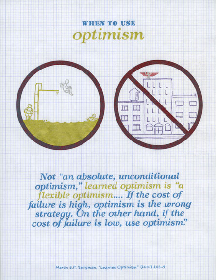
Christine Wong Yap, Positive Sign #19 (When to Use Optimism), 2011, glitter pen with foil print on gridded vellum, 8.5 x 11 in

Much of Christine’s approach to art making is based on her extensive research into the realm of positive psychology. Put forth by its main figures Martin Seligman and Mihaly Csikszentmihalyi, positive psychology is meant to supplement traditional psychology, not replace it. Instead of treating just mental illness, Sligman and Csikszentmihalyi propose, what if we attempt to make ordinary lives more fulfilling? Immersing herself in the literature of the movement (accumulating titles such as The Happiness Hypothesis, Born to Be Good, Flow, and Rainy Brain, Sunny Brain) Christine has latched onto a particular symbolic language of her own. This is most evident in Positive Signs, a series of glitter and fluorescent pen drawings on gridded vellum. In these, she uses the structure of info graphics to explain complex principles of positive psychology to a general audience.

For Positive Signs Christine embodies the role of the cheerleader, the explicator, and the friend, offering up lessons such as this one from Seligman: “Life inflicts the same setbacks and tragedies on the optimist and the pessimist, but the optimist weathers them better.” Moving beyond Zen-like statements into the actual visualization of these principles, Christine tests the limits of info graphics to clearly relay data. Do they explicate or further confuse? She admits to being deeply interested in futility of her attempts to pin down happiness, chart its existence, and explain the tactics for increasing its probability. Reading Positive Signs en masse, I find myself invigorated and justified in my own artistic pursuits. The graphs and charts give shape to the intangible subjects with which many people—not just creative types—wrestle, supplying tools for how we can shape and facilitate positive thinking. Positive Signs are guidelines for promoting happiness in our own lives.
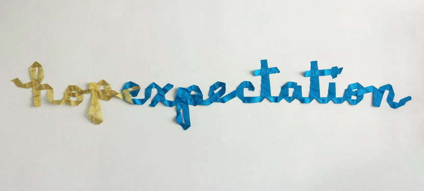
 Christine Wong Yap, hopexpectation, 2011, 101 x 18 x 1 in

At one level, Christine’s work functions as a barometer of sorts—you are either gladdened or repelled by the fluorescent hues, flowing banners, starburst patterns, and multitudinous kittens. But beyond this surface treatment, she addresses a number of curious aesthetic assumptions with regard to class, economics, and the function of art objects in general. In Christine’s hands, previously disposable materials become art objects that exist indefinitely, their ability to bestow a dose of happiness prolonged and potentially magnified. There is no shame, Christine believes, in the decorative impulse. High or low, cheap or expensive, the results of that impulse rest on your ability to analyze and promote the conditions for happiness in your own life.

Ten Banners for Home and Office provides you with a choice. Use it as you would any sheet of decorative stickers: plaster it about town. Preserve it as a fine art object, intact and on display. How is it meant to be treated? Ask yourself which will make you happier. Then you have your answer.

As the Fonz would say, “Exactamundo.”



Sarah Hotchkiss is an artist and arts writer living in San Francisco. She contributes regularly to the KQED Arts blog and Art Practical. She received an M.F.A. from California College of the Arts and a B.A. in English Literature from Brown University. In 2011 she was the recipient of an Alternative Exposure grant for the curatorial project Stairwell’s. Her artwork has been shown in the greater New York and San Francisco areas, including Adobe Books Backroom Gallery, ATA Window Gallery, and MacArthur B Arthur. Past residencies include the Vermont Studio Center, Skowhegan School of Painting and Sculpture, and Esalen Institute.

 

Julia Goodman: Overlap

Is there a material more often overlooked than paper? Our everyday lives are full of it: receipts and packaging from purchases; flyers, wheat-pasted movie ads and parking tickets; to say nothing of the papers that record our private thoughts and then carry them over distances. It is the ubiquity of this humble material that almost guarantees that it be disregarded. In order to reconsider paper, it must be presented to us in a form that we have not seen before, provoking a reaction of surprise before we settle into the reassuring feeling of prior knowledge and connection.

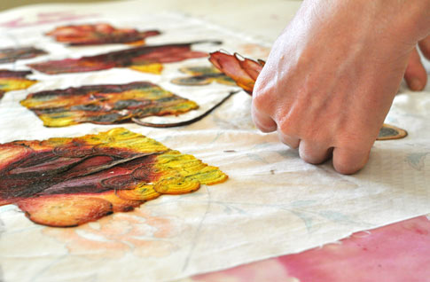
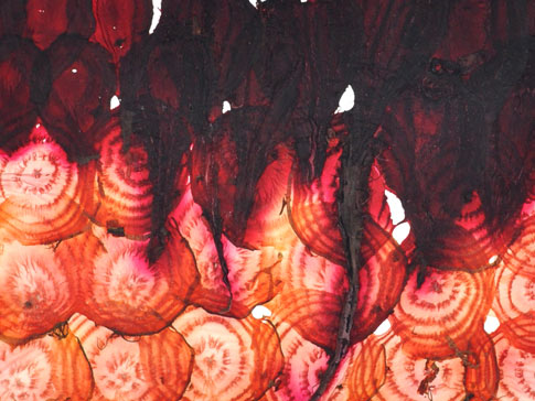
Julia Goodman’s work often provides this provocation, enlivening the familiar by making it temporarily strange. Her edition for The Present Group is mysterious and intriguing. At first, you might only marvel at the colors of the beet papyrus: a gentle spectrum of deep reds and purples, along with some yellow or white, plus a bit of dark green or black along the margins. Then comes the question of the material itself: What is it? Beet slices, cut thin to the point of translucency, then overlapped and dried. And then an inspection of minutiae, tinged with pragmatism: Are the slices stitched? How do they hold together? You might be surprised to find that the papyrus is a bit of ordinary magic, conjured from common materials and simple processes to make a symbolic object.

Physically and conceptually, Goodman’s beet papyrus is centered on the notion of overlap. Synonyms for this verb evoke the phenomenal or concrete: imbricate, overhang, protrude, shingle. These words focus on materiality and mass, on the edges of substances that meet in a certain physical arrangement. Yet overlap is also connected to the more abstract concept of coinciding or having in common. Both forms of overlap, the action and the idea, are central to Goodman’s art practice.

When I met her in 2009, Goodman was making work from junk mail, an exploration of materials that grew out of her interest in economics and sustainability. Using these repurposed communications, she created small sculptural objects and wheat-pasted them in urban locations, bringing handmade and ephemeral forms to hard, industrial surfaces. With these works, Goodman juxtaposed fragility and softness to concrete, creating an overlap where, for a time, opposing textures existed in the same space. What has always struck me about her work is that it is made from broken-down or divided and recombined substances. Goodman’s work reduces a material all the way to its basic form, and then rebuilds it into something new.

Goodman is grounded foremost in process, so to understand the idiosyncrasies of papermaking is in some way to enter the mind of the artist, because the process of papermaking may be the ultimate physical expression of having in common. Its manufacture is simple: first, plant fibers are broken down, and then the fibers are allowed to reconnect. Specifically, the fibers are bruised and opened while in a water bath, and then as water is extracted from this slurry the fibers re-bond, linking themselves back together in endless networks that take the shape of the mold they are in, be it flat (as in sheet of handmade paper) or a more sculptural form.

In part, Goodman makes paper because she loves working with her hands and believes in making art that is the result of direct touch. She tells me, “There is nothing between my hands and my materials—no brush or pencil,” and her direct physical engagement with the work is evident at every stage, from the tearing of fibers or cutting of beets to the process for extracting the water from the paper: pressing it with her hands, pushing it into a wooden mold, even stepping or standing on it to push the liquid out of the interlocking fibers.

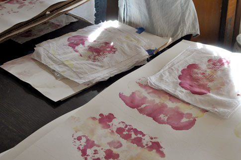
The making of this edition was no different in terms of physical involvement. Like traditional papyrus, in which the fibers are not bruised or opened but laminated in layers, each beet was harvested, sliced thin on a mandoline, then arranged with other, differently-colored beet segments on a white cloth, and finally pressed and dried. Under pressure, the cut beet fibers rebond, grabbing onto each other and reconnecting to form a new whole. There is no stitching, and no adhesives are used; the process is both deliberate and organic, with Goodman controlling the circumstances but letting the fibers do what comes naturally. While drying, the beet papyrus shrinks and stains the cloth beneath, and that stain becomes evidence of the original form and records a history of the process.

Papyrus is a material that is sensitive to its environment. Expect your beet papyrus to respond to the weather, reabsorbing ambient moisture and re-drying as the barometer rises and falls. At every level, this form of paper is physically reactive and mutable, from the individual cut fibers that reach toward reconnection, to the final piece that shifts almost imperceptibly to match the circumstances of its surroundings. Papyrus is a basic form of paper, and paper is a recording device.

Goodman grew many of the beets for this project and purchased the others from local farmer’s markets. That means that the papyrus was produced in this area, from seed to final paper. It is intensely connected to the geography, climate, and labor of the Bay Area. Further, the fact that it is still potentially edible brings the beet papyrus back to physicality, an overlap between the body, the material, and the process. In her studio, Goodman shows me her bag of food, including beets, from the farmer’s market. “My groceries and my art supplies are in the same place, touching. There is no need to separate my art practice from my life.”


Bean Gilsdorf is an artist and writer. Her exhibition reviews and interviews have been included in print and online publications such as Textile: the Journal of Cloth and Culture, Fiberarts Magazine (2007-2011), Daily Serving and Art Practical. For Daily Serving, she also writes the weekly arts-advice column HELP DESK, co-sponsored by KQED.org and reprinted at HuffingtonPost.com. Gilsdorf is a 2011-2012 MFA Fellowship Resident at the Headlands Center for the Arts. She lives in San Francisco.


Bad at Sports: Hyperjunk Response

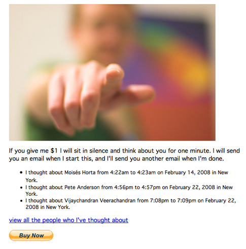
Nicolas O’Brien, one of the artists in the current Art Micro Patronage show, “Can’t Touch This” curated by Karen Archey, also writes a column entitled Hyperjunk on the Bad at Sports blog.  He was kind enough to include us in his most recent post, ”Hyperjunk: Observations on the Proliferation of Online Galleries,” a thoughtful survey and analysis of current online galleries.

However, there are a couple of points in the article that caught our attention, specifically in regards to our project.  In the spirit of keeping the conversation going, we’ve included some responses below:


If an ideal environment of an artists working online lies within the personal computing web-browsing experience, then why the need for relocating these works into another specific website/framing? What is “more accessible” about an online gallery then an artists personal website? Are the tropes from the traditional gallery system still playing too significant a role in the way in which net-art is being presented?


With Art Micro Patronage the idea of the curated group show is central.  We’re trying to encourage criticality about what is happening online by hiring curators to bring together artists whose work explores similar themes.  The internet is incredibly diverse and far flung which makes the process of synthesis and curation that much more important.  I trust some institutions and curators to do the research and outreach to bring to my attention artists whose work I may not have been exposed to otherwise, but also to highlight what is happening more broadly.  So maybe it’s not the works themselves that are rendered more accessible, but rather the connections between them.

To favor one system over the other, or to underscore the supposed ignorance of major cultural institutions for not having more net based art, can position the artist, work, or community as having ingrained entitlement due to its novelty.


I’m not sure I agree that it deserves entitlement due to its novelty.  In the late 90′s and early 2000′s there were quite a few institutions that were collecting and attempting to show net art.  But most gave it up.  At that point there was an exuberance about the novelty of anything and everything that was happening online.    However now I believe we’re at the point where the technology has caught up and the novelty has died down, and because it is so ingrained in our culture, the work that is happening online in a cultural context deserves critical attention.  It was in part the recognition that artists working online isn’t novel at all that motivated us to do this project.

Further, we hope to continue expanding the idea of what is considered “netart”.  We intentionally found curators working in diverse parts of the artworld in order to cull different works and types of shows.   For example, our next show curated by Dena Beard highlights the work of primarily social practice and conceptual artists who use the web to document their more ephemeral practice or as a site of exchange.  While these may not be “net artists”, the internet is an important part of their practice.

Records of Drawings by Christine Kesler

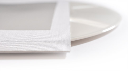
To begin writing about Joe Hardesty’s work for Audio/Visual, the latest edition of The Present Group, I began by holding my test pressing of the new issue: examining the forms within the stiff cloth-covered record case, the sheaves of paper printed with elegantly composed text, sliding the record itself out of its paper sleeve—considering the package as an object. I appreciate the simplicity of this set and see Hardesty’s philosophy and austere sense of materials at work here. Hardesty’s newest work revolves around time- and text-based experimentation, while utilizing a strict economy of form; there is a sense of tight control in the way the record is put together, in both the text printed on the sleeve and in all of the material choices evident in this edition.

The feeling of experiencing a highly mediated work grows stronger in listening to the elegantly executed tracks contained on Hardesty’s record. I’d prior listened to the tracks as mp3s that showed up in my Dropbox folder one day, which was an even stranger encounter than perusing Mr. Hardesty’s website or having this elegant package in my hands. Before the record had even been pressed, I listened to the rising and falling of a stranger’s voice, in headphones, one Sunday morning, via raw audio tracks. Listening to the tracks and knowing a record would be on its way soon, I felt anticipation in knowing that this object would bring about a new dimension to the work. If drawings were once seen as the preparatory work, a lesser-finished product than the studio painting, then listening to Hardesty’s raw audio tracks was akin to listening to drawings, with the clean white record itself serving as a highly controlled final product.

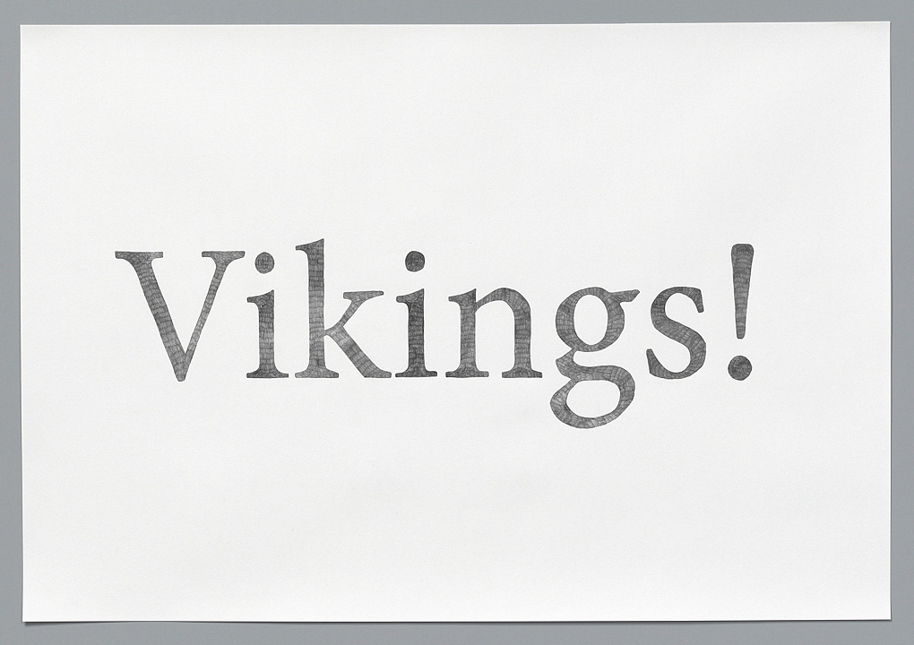
I also explored the work of Joe Hardesty as images online: hand-drawn text that appears to describe the act of creation or the process of another work in progress. His work is photographed in gallery settings or tightly cropped into drawings, mediated further by a laptop screen on which I view them. Hardesty states in his description of the Text Drawings series that he wants to make “the act of imagination… both visible and entertaining.” It is also his clear intent to mediate the acts of making and looking; and to control the experience of time and material for his audience, with precisely rendered text drawings and even more so with these audio tracks. Hardesty, most expressly with the record produced as Audio/Visual, Issue 19 of The Present Group, holds his audience captive in giving them his renderings of the created world around him.  In each audio track, he is seemingly describing a work of art in front of him, but he denies visual access to his listening audience. He uses quite plain language that captures quotidian scenes such as grey cobblestone warmed by sunlight in the opening track, Finest Looking; and more bizarre and grotesque ones, such as anthropomorphic safari animals being observed by a group of obese spectators who are eating Kentucky Fried Chicken, in Lions. With a satisfying economy of language, Hardesty gives the impression that a finished work exists, and he acts as the sole agent of such works. It remains a mystery where or if a finished work exists at all, outside of his text and audio renderings.

Joe Hardesty:  Vikings  2009  Pencil on Paper  27.5” x 39.5”    image courtesy of the artist

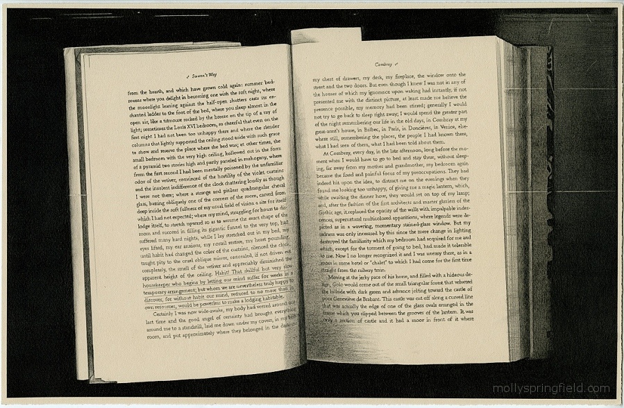
Similar to Washington, D.C.-based artist Molly Springfield, there is an aspect of deception in viewing Hardesty’s visual, text-based work. Springfield has spent years creating meticulous drawings of seminal texts, in photo-realistic renditions of photocopies of those texts. Her work brings up a similar tension between text and image; she brings to light the evidence of a hierarchy but then turns it on its head. Hardesty too plays this game with his pronouncements of the works he wishes the viewer to experience through him. He acts as mediator whether he is creating works that describe another work, or reading the poems that populate his drawings.

Molly Springfield:   Page 5   Graphite on paper   11 x 17 inches   image courtesy of the artist

An evolving thought occurs to me as I’ve been learning more about Hardesty’s work: I’m struck by how poetic, restrained and spare it is in its material considerations, but upon continuous listening and viewing there is a great sense of playfulness even in light of how tightly executed and controlled his finished works may be. The forebearers of Hardesty’s practice include poets and artists such as Sol LeWitt, Bruce Connor and Mel Bochner, as well as Ian Hamilton Finlay and other concrete poets who drove the conceptual art and concrete poetry movements of the 1960s. All of these artists investigated their own means of mediating artistic and linguistic experiences, as does Hardesty in the audio tracks accompanying this essay.  All of the aforementioned artists work with the ideas of language and time as material; each of them, even in experimentation, exhibits great control over their material. Hardesty, much like his predecessors, serves his listeners the experience of looking, but in a manner wholly controlled by the artist himself.

Hardesty, in giving us these text drawings in the form of audio tracks, pressed onto vinyl, is dictating the terms of our engagement with the work. The record begins: “This drawing looks down a steep hillside street paved with grey cobblestones…” Suddenly, I remember how time seems to slow down when listening to a record… how it holds your attention, without headphones, without a practical way of rushing from points A to B while still listening. I must stay close and flip the record when it is time and I realize that this is exactly how Hardesty meant for me to experience his sound works.  Hardesty, in every aspect of artistic execution, smartly wields the controls.

When There Is No Narrative: Searching for Meaning in Aaron GM’s 5 Improvisations within the mundane to affirm the present moment

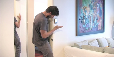
The questions that emerge when watching multiple, virtual Aaron GMs perform in the spaces of an apartment are those I might ask when attempting to understand a stranger speaking and gesticulating in a foreign language. What is he trying to convey, if anything? Why? What relationship do his words, or murmurs, have with the space he inhabits, and to his movements?

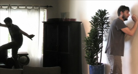
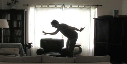
With tight, fluctuating hand gestures and repetitive spoken words, Aaron is seen busily occupying five areas of a domestic interior. He seems to be mapping out a kind of disjointed narrative on a kitchen surface, on blank walls and in the air, with some degree of urgency. This is not, however, a story of any linear kind. Instead, Aaron lists and repeats words, in a monotone, and, maddeningly, the narrative goes nowhere. The interactive feature doesn’t help. Viewers, by moving their cursors to the right or left of the screen, can navigate a circular path around the apartment to observe Aaron perform in the five spaces he occupies. Investing viewers with agency further confounds the expectation of locating some narrative progression, making the experience all the more circular.

At times, Aaron has an aspect redolent of an obsessive compulsive, or a malfunctioning robot, reduced to a limited repertoire of physical and linguistic vocabulary. Yet, there is also a sense of intense concentration, of careful method and study to Aaron’s actions. The inclination to subject these collections of human expressions to some order is, for me, irresistible. It is tempting, too, to grasp for familiar media that the performer’s body language recalls. The precision and restraint in the movement of his hands, for instance, conjures sign language, or the art of mime. I imagine a round red ball will materialize between his fingers fleetingly and disappear again. By the couch, he employs a leg to create sculptural spaces, thereby adding another layer to the expression of his voice and hands. But Aaron’s work ultimately defies categorization. After a long period of time struggling to discern patterns in the video, it occurred to me that there might be no narrative here at all—that Aaron’s actions are not an effort to communicate with his audience through any known language.

Indeed if there is a conversation underway here, Aaron is having it with himself. Viewers are silent witnesses to the performer’s outward expressions of internal thought processes. The nature of these expressions suggests the workings of an unconscious mind: his speech takes the form of unorganized and repetitive (and sometimes undecipherable) references and fragmented phrases. In other words, the kind of unmitigated and mundane references and images I find myself scrawling onto a page through automatic writing. In the corridor, for example, Aaron lists a hodgepodge of celebrity names (“Mena Suvari”), brands (“Tylenol,” “Sprint”), television programs (“Entourage”), media-popularized phrases (“trickle-down effect”) and abstract images (“invisible string”) among many others. In the kitchen, Aaron is fixated on describing (what sounds like) a “walk”. The word is repeated over and over again in slightly different phrasal variations. At the same time, his hands negotiate the spaces around him thoroughly, using them as reference points for his nonsensical narrative.

Through this outpouring of everyday references, Aaron’s words absorb weight (not in the sense of meaning, but in the sense of physical presence) and rhythm. With every repetition, the words become less and less meaningful, and take on a material quality of their own. Aaron’s actions are, perhaps, best approached as a multilayered inquiry into human interaction with space; using his body and his voice, Aaron creates space, acts on it, measures it, inhabits it, brings textures to it. He bounces words and sounds off walls and surfaces, and uses his hands to frame and define them, as though to affirm proof of their physical presence. This is where Aaron’s title springs to life. Using his voice to draw forms and reinforcing them with corresponding movements, the artist effectively employs his body to assert the present moment.

The ubiquity of Aaron’s references matches the ordinariness of the apartment setting he inhabits. If we accept (as hard as it is to do), that his words don’t contain meaning, just as we cannot draw any intellectual sustenance from the commonplace white walls and modern furnishings of the apartment, we can begin to approach Aaron’s actions simply as the building of shapes with his arms, and legs, and voice. By using the tools of language to occupy and create space, viewers may fall prey, as I did, to the urge to decode Aaron’s unfamiliar mode of expression through traditional channels of communication. The artist challenges us to unlearn, for a few moments, the trappings of language, and find the message in the medium. Liberated from the cognitive processing of language, I found something far more stable: the tangible, physical occupation of space.


Tess Thackara is Senior Reviews Editor at Art Practical, an online arts journal to which she also contributes writing. She holds a BA degree in English Literature from Trinity College, Dublin, and has completed internships at Phaidon Press, and McSweeney’s—where she contributed research to Dave Eggers’s creative nonfiction work, Zeitoun. Her photography has been exhibited in London, and she recently produced a short documentary film about artists Richard and Judith Lang.

Against Generosity, or: Steve Lambert, and a Lot of Other People, Want Something From You

Generosity is a lie. To be more precise, generosity, as a form of absolute selflessness is almost never achievable, and most often when you come across someone attempting to be actively generous it’s an action rife with conflict and contradiction. Though we hate to admit it, we shouldn’t worry about this too much. Unless you are training to be the Messiah why should it be any other way? People want to redeem themselves, they want to boost their ego, their sense of self-worth. People want to do good deeds for any number of reasons. And yet, to continue the adage, our punishment for our good deeds done is often the guilt in knowing that we wanted something in return for our actions, no matter how incalculable that return might be within our own heads and hearts. However benignly or benevolently, however grossly, we are selfish beings. Is that so wrong? How much good is psychically corrupted in hiding it?

Would it be more helpful for us to start describing these acts in a somewhat different fashion, a fashion more productive to the situation at hand, one that for semantics sake doesn’t degenerate into questions of intent? There’s no shame in admitting that we get something out of giving. It doesn’t dilute the gesture or its value. We create our own values when it comes to unregulated and intangible systems of exchange. Let’s therefore promote a community of reciprocity wherein our return, the exchange in question, is self-determined. Let’s do away with the problematics of generosity for something more anarchic, more complex, more… generous in deed than definition.

Steve Lambert – his person and his work – exists on a continuum in a long line of absurdist provocateurs hell bent on changing the world for the better one sincere, well-formed, slightly ridiculous gesture at a time. Sometimes it’s not intentionally so ridiculous, it’s just that from the outside, for those not already there, it can seem a little far-fetched. But just wait. You’ll see. He makes objects and actions in equal measure, never favoring one over the other – they are all constructed as a means of provoking dialogue around various political subjects, profound and humorous alike. For Lambert these bits of provocation are intended to get people thinking (and talking) about how they act, what they believe, how they imagine the world around them, and how they imagine what it could be. Inaccurately defined, his work is generous. It gives a lot of itself. It also asks for much in return from its viewers and participants. So, from here on out, I’ll use Lambert as an agent for my argument.

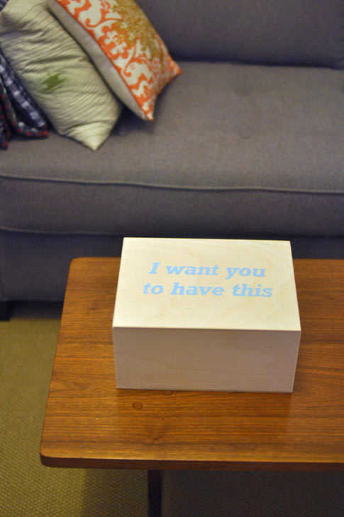
Lambert’s newest project is an edition, a simple wooden box with the words, “I Want You to Have This” inscribed upon it. Keep it by your front door. Put that scratched copy of Come On Feel the Lemonheads inside, your old rabbit’s foot, the weed someone gave you and you’ve kept in the freezer for years, in the hopes it will remain fresh, thinking, “I like pot. I’ll smoke this someday. The perfect day…” and yet you just never got around to it. I Want You to Have This allows you to give away the shit you don’t want anymore, the items that follow you, from one house to the next, one phase of your life to another, like a benign demon, a cuddly, lice-free, and not all that heavy monkey on your back. They aren’t too much of an intrusion or burden, these items. But honestly, they take up space and you don’t need them now, and you might not ever have to begin with. Why not give them away? The piece is a very simple gesture that aims at discussing a less than simple subject; the transparency of a gift delivered insincerely. A gift can be a burden, and a burden given in the guise of a gift can really piss people off, as cultural norms state that you have to accept the damn thing without complaint.

These days it seems to call someone out as a Social Practice artist is to say they are doing something, which for one is public, as well as new and difficult to define. Or to call some a Social Practice artist is to say that their work is, again, public and that they aren’t trying hard enough. Lambert is a Social Practice artist, but not quite for either of those reasons. His work is about publics, yes. And his work is not hard to define or difficult. It is deceptively simple. Simplicity, as a methodology, is a great asset in the creation of a public around a piece or practice. It allows those who engage a work to enter into the piece easily, with confidence that they are aware of its place in the world, how it works, and how they are to engage it. From there on out, they gain the agency to consider, deconstruct, and absorb the work as their own. They are aware of the ruse, the trick, the framework, and in the case of Lambert’s practice, their “in on the joke.” His work, in line with a particular stain of Social Practice, is public in that it is often situated outside of the gallery space, but far more importantly it is about galvanizing a group of unknown people around an idea to consider it and make it their own. It is open. It is malleable. It grows from project to project to include others. It continues conversations from one to the next, and encourages the viewer/participant to converge with the work of other practitioners, as well as become one themselves if they do not consider themselves one already. It asks us to do this work till it doesn’t become work any more but life. It asks us to form A Public around our work so that through embodiment and accumulation it may become The Public, i.e., Common Place, Quotidian. It represents itself in a state of becoming, in that it suggests to those who encounter it a possibility of a future, a future which they are part of – with others.

Social Practice accepts and values the influence of other fields and histories outside of the aesthetic realm. Furthermore, contrary to what one might expect, Social Practice values art and aesthetics equally as much as the practices so-called outside influences. And, with that in mind, it finds that the designation of art can allow one to mine fields and hybridize them in a manner to elicit dialogue around issues that are important to the practitioner, and as this work is about the formation of publics, those that gravitate towards the work. Of course this forces one to mention an important issue – there’s a lot of disingenuous crappy social practice work out there that doesn’t work hard enough, that isn’t critical of its own intentions, and yet due to its relative “newness” gets lumped with the rest. This is work that wants to give, wants to be (pseudo)generous, without being honest with its intentions or desires, without being open with its tensions, which are generative and nothing to hide. I say this without a want to be cynical, and I’d argue that my statement isn’t that. It’s to say that to create a space that values the socio-cultural and political intentions of its rhetoric the person or people who envisioned and desired that space need to get naked, fight to relieve themselves of hierarchies, and attempt the creation of an area of questioning as much as an area of statement making. Too much Social Practice continues to value statements over questions. I’d argue though that the questions, in the end, are the slightly more valuable by-product of the two. Good questions provoke more thoughtful statements. Questions, which are of honest concern to those who ask them, are reciprocal in nature.

And this brings us back to my original point. A practice concerned with the formation of publics, the notion of social art as a form of generosity has become increasingly prevalent. For a practice whose strengths, for one, lay within its non-hierarchical stance, this is disingenuous when inconsiderately employed. In response to the work of artists such as Harrell Fletcher, do-gooder work abounds, with more and more works and projects proposing to do this and that for someone. But the imitators and the influenced, as well as Fletcher’s work itself, seem dangerously hollow. I say dangerous because I see and believe deeply in the public possibilities and political efficacy of a certain strain of Social Practice. When a work or worker presupposes that they have something to give to someone without making it plainly apparent that they get something in return for this act, a system of hierarchies is established and allowed to flourish; between artist and participant, between white people and people of color, between middle class or rich and the poor, able and disabled, and so forth down the line. A practitioner working in this way promotes dictation over facilitation in that its more about making statements through their interactions than it is about asking questions of the people who allow that interaction to emerge, or about being publicly questioned ourselves. We need to express, in overt, theoretical, even aesthetics terms that we as social practitioners are part(s) of the public which we are actively attempting to form, not actors alongside or outside the public(s) which we endeavor to help create. And, if it is evident to others that, in certain circumstances we do not consider ourselves part of that public, we need to ask difficult questions of ourselves if we wish to see the work we do as separate from ourselves while continuing to be politically efface-able. Simply put, our concerns and actions need to be reciprocal in some form or another, and this reciprocity needs to be visible. We need to ask, “What do I get out of this,” with as much intention as, “what can I give.” This is a problem that Lambert handles often, and elegantly.


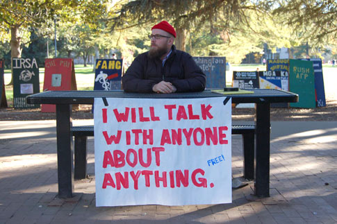
Steve Lambert, “I will talk with anyone…”   January 2006    image courtesy of artist

Whether creating a space to publicly talk “about anything” (as in Lambert’s 2006 work, I Will Talk With Anyone…), or an object that asks its viewer to consider the manners and habits in which we give of ourselves to others (as in Lambert’s newest work), an exchange between maker and participant takes place in the work we make. In this sense, there really isn’t too much of a difference between I Want You to Have This and another work of Lambert’s, a collaboration with The Yes Men and many others, entitled NY Times Special Edition. Each work takes a simple object and presents a set of possibilities and problems in front of those who encounter it. Both are works that are supposed to live with you, rather than you visit them, in that they enter into the most quotidian aspects of our day; our commute, a visit to a friend’s house. While the scale of each project differs, the intentions of both are of a piece. They ask us to question the things in our life that we find most common place and immovable; the material wealth we collect yet find burdensome, our complicity in war’s fought in our name, education and the models we accept for ourselves and others, or our participation in economies of all sorts. With a slight smile they ask, “Well… what if?” They give something to you for free, and yet ask you to do something with the information or object you’ve received. They agitate for us to question our considerations. They are anything but singular, anything but passive, anything but generous as we know it.
.

.

Sam Gould is co-founder of Red76, a collaborative art practice which originated in Portland, Oregon in 2000. Along with his work as the instigator and core-facilitator of many of the groups initiatives, Gould is the acting editor of its publication, The Journal of Radical Shimming. He is a senior lecturer at the California College of the Arts in San Francisco, Ca. within the Graduate Fine Arts Dept. for Social Practice and is frequently a guest lecturer at schools around the United States and abroad.

Gould’s work has been activated through projects and lectures on street corners, in laundromats, bars, and kitchen tables, as well as through collaborations with museums and institutions such as SF MoMA; the Walker Arts Center; the Drawing Center; the Bureau for Open Culture; Institute for Art, Religion, and Social Justice at Union Theological Seminary; ArtSpeak; Printed Matter; the Cooper Union; the New Museum/Rhizome; Manifesta8; and many other institutions and spaces worldwide. He was one of nine nominees for the de Menil Collection’s 2006 Walter Hopps Award for Curatorial Achievement, is a founding “keyholder” of MessHall, and was the 2008 Bridge Resident at the Headlands Center for the Arts.

How To Really Listen Is Sometimes To Talk

A Review of Lichen Books: On The Road by Rebecca Blakley

“And the landscape will do/ us some strange favor when/ we look back at each other/ anxiously” –Frank O’Hara

How do we listen to each other? Is listening an act of knowing another? Is real, true listening even possible? These are the questions I kept coming back to while reading Lichen Books: On The Road. It’s the story of a girl looking for answers written on post it notes and inserted into Jack Kerouac’s novel On The Road. The novel tracks Sal Paradise, a narrator in search of something unnameable, while weaving through a multiplicity of characters constantly traveling and talking to each other. Staying up all night, even, just to talk, in hopes of arriving together at some new understanding of each other that will solve their problems. Rebecca Blakley’s narrator also roams the country in search of another, or a self, or a job, or a decision she can feel certain of. Even when she’s talking to people, it seems as if the landscape or indecision prevents her presence. These characters keep looking for responses from each other that provide any sense of connectedness. The distance of Blakley’s narrator from others in her story indicates, ironically, Blakley’s remarkable ability to listen.

We finish this novel and story feeling like we still don’t know if anyone really hears each other—and there’s a desolate sadness—as large as the dark endless highways that populate this story—in the realization that we might not ever. And yet, Blakley demonstrates considerable trust in our ability to engage with the text, in our ability to listen, by making visible the temporality of our responses through her chosen form—they are just sticky notes, after all, and one could effortlessly discard them, or rearrange them. She’s highlighting the impulse to respond (the desire to conflate one’s story with another’s, to tell one’s own story as an indication of listening), as perhaps the only form of true listening, however flawed. There’s beauty in the humility and faith required to tell a story on slips of paper that we often throw away everyday.

Often in Blakley’s text, I found myself surprised at the quotidian nature of her intrusions—recounting rather plain details of travel that don’t feel especially essential. Retrospectively, those details revealed themselves as an important interaction with, or mirroring of Kerouac’s style—he spends a lot of time getting people from one point to another and in any one moment of the book one could think: is this really necessary to this novel? But that’s the whole point—it’s an accretion process, not a linear building of narrative, any moment is every moment, full of every possible emotion. Any one detail is not important, but instead the heavy and total imprint of their bodily enactment of life. In this way, the novel becomes a kinesthetic experience—I so often felt it bodily, alongside the characters—and it’s an astute and important choice that Blakley interacts with this text in the way she does. It’s as if she’s saying, in our responses to each other, no matter how absurd, there is hope.

While reading her responses, I felt my own presence in a way that was uncomfortable—I wasn’t sure I wanted to be reminded of my self-as-reader in the present moment. Isn’t that partly why we read novels—to escape our bodily experience? Blakley is complicating this convention with the materiality of her chosen form—you must lift her notes off to read the text underneath or interrupt the novel to read her story. And yet I grew to look forward to the notes, because they activated the text in unexpected ways. In a particularly bright moment in the middle of the book, the narrator of Blakley’s story lies down in the salt flats on the same route that Paradise was on a few chapters back, confused as to what to do with her life: “I felt like I had turned into a pile of salt. But it wasn’t a punishment, it was natural. It was where I was supposed to be. It was settled—I would lie in the salt until I knew what to do with my life.” The intrusion serves to build out Kerouac’s work, to emphasize its timelessness, and also contextualize and layer hers. Blakley’s scene recalls the circular nature of Paradise’s journey through the novel, finding himself repeatedly in altered and peripheral experience. Meanwhile underneath her text, Kerouac lyrically comments on the nature of the western landscape: “for the house was in that part of the West where the mountains roll down foothilling to the plain and where in primeval times soft waves must have washed from sea-like Mississippi to make such round and perfect stools for the island-peaks like Evans and Pike and Longs.” Blakley keeps her prose exceptionally flat; she lets Kerouac do the work of lyricism that sets a backdrop of expansive, aerated time, while her story’s similarity to Paradise’s compounds for us the commonality and collective nature of our angst.

Blakley’s experiment provides the sensation of a story being told in rounds—both narrators exploring the same isolation and feeling of irrelevancy in a vast and indifferent landscape—but hitting different notes at different moments, which exposes the vibrant and mysterious urge for storytelling (response) itself. This, in turn exposes the stakes of the first person narration of both—we may always feel confused about our purposes and roam the roads feeling lost, but the urge to make sense of this experience through telling our stories, responding to life, has the capacity to provide a momentary sense of order.

That’s the ultimate success of this intervention—it exposes a natural conflation of those impulses—to know the self and other, and to know a text. The manifestation of those impulses is our responses to each other. Blakley pays Kerouac the high compliment of being his fan and critic; at times she seems to be poking fun at Kerouac’s frenetic lyricism and Paradise’s unconscious privilege through her flat and minimalist prose, at other times she reverently concurs with his insistent portrayal of life as a restless quest after unfulfilled desires.

I think the most we can hope for is, in listening, that we are called to respond. Maybe here, response is the act of love Blakley is exposing. That we’re not in a void, that our words matter to each other. The position of the reader is made more active, because we’re being asked to examine our own stakes in these stories, in a direct physical interaction with sticky papers in a book—we’re asked to find these stories familiar, as something we recognize, as something worth responding to.

.

.

Sarah Fontaine lives in the Outer Sunset of San Francisco, California. She co-directs the studios and project space at the Carville Annex, a site for investigating people and place. She seeks higher stakes. Her writing and other experiments can be found in Plaid Review, Reading Conventions and factorycompany.

Art Publishing Now!

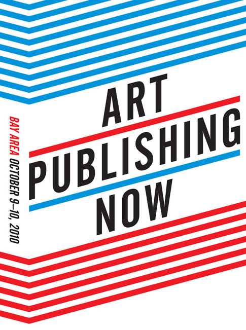
Art Publishing Now

Art Publishing Now

is a two-day event dedicated to the investigation and showcasing of art publishing practices in the Bay Area. It includes a day of presentations and critical discussions, an after party, an art publishers fair, library and web archive.

.

Participate:

.

The Library is still seeking submissions!
Deadline October 1st.

The Art Publishing Now Library is a physical and online archive of Art Publishers in the Bay Area. APNL is a self-defined collection; it is open to any project that considers itself an art publisher or a contributor to art publishing in the Bay Area. The library will be installed at Southern Exposure from October to December 2010 and will go on to find a new home in the Bay Area.

.

Join the Conversation!

THE SUMMIT is on Saturday, October 9, 2010, 11 am – 6 pm
FREE & OPEN TO THE PUBLIC
Space is limited so be sure to register to attend!

The 2010 Art Publishing Now Summit invites you to join leading creators of print, online, and experimental publications to reflect on the most urgent issues and exciting possibilities in art publishing today. With topics ranging from “Publish AND Perish” to “West Coast Critical?”, the event will include a series of presentations, conversations, and panels intended to yield insight and encourage innovation in Bay Area art publishing.

.

Learn about local art publishers!

Sunday, October 10, 2010, 11 am – 6 pm
FREE & OPEN TO THE PUBLIC

The Art Publishing Now Fair showcases the breadth and depth of art publishing projects in the Bay Area. The fair hosts Bay Area independent publishing and related projects presenting a diverse range of the best in contemporary art publications ranging from periodicals, websites, editions and more.

.

Party with us!

Saturday, October 9, 2010, 6-10pm
FREE & OPEN TO THE PUBLIC

Join Art Publishing Now Summit and Fair participants for a get together at Southern Exposure. Purchase food from some of SF’s favorite street food vendors including El Tonayense Taco Truck. Drinks and libations by donation from Trumer Brauerei, BridgePort Brewery, and Spoetzl Brewery.

Expanding the Artistic Practice by Jennifer McCabe

Right and wrong, good and evil—maybe I have always been one drawn to the gray area of life. Likely that is at the heart of what draws me to the art world. I am attracted to contradictions and aspects of life that are complicated—not simplified into categories of black and white. The work of Nava Lubelski is rich in contradictions—just the kind that make it a very compelling artwork.

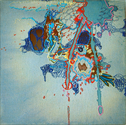
Old Tricks for New Monkeys is a vibrant canvas with colors seemingly caught in motion. Beautifully detailed threads create a palette that pulls the viewer in and keeps the eye engaged. Yet even the title of the piece is a juxtaposition of opposites; and this gives a sense of the multiple contradictions that build layers of content beyond the visual itself.


Monkey See and Do, 12″ x 12″, thread on canvas, 2006.  Image courtesy of the artist.

This work began as organic stains on fabric that were then hand embroidered by the artist. The process of embroidery is a laborious one, at once meticulous and fine. So from first glance one sense’s the accidental nature of a stain, and begins appreciating the shape and color, only to find that there is a complicated handiwork involved, one with very intentional impulses. The artist has said about her own work in general,

I love art that encourages a perceptual shift in the viewer, particularly a humorous one. My work in a certain sense is a one-line joke about the rewards of “looking closer,” although obviously it’s really labor intensive and complicated as well. I began this technique as an outgrowth of painting and then collaging with fabric, but I got interested in thread and the tiny, rigid structures of the stitches. I became curious about why stitching was always stigmatized as decorative and crafty – I went about finding the least practical, least structured, least controlled graphic imagery that I could embroider and happened upon the “drip.” I liked the idea that from a distance the pieces would look so fluid and painterly, but contain this surprise of shockingly time-consuming deliberation.

Karen Rosenberg’s 2009 NY Times review places Lubelski’s work in the art historical category of artists who ‘paint’ with thread, such as Ghada Amer and Michael Raedecker. The review also illustrates the relation of masculine and feminine elements inherent in her work, as in the ‘male arts of paint-splashing’ and the ‘female fabric-staining and needlework’. There is a tension between the feminine and masculine aspects of the work that grows stronger with the introduction of the digital medium.


Monkey See and Do, digital tracing, 2010.  Image courtesy of the artist.

In order to produce this work for The Present Group, Lubelski chose to work with a machine to embroider her original design. She began by doing a computer drawing that was a tracing of an earlier piece that she had stitched by hand in response to an organic stain, wanting to see what would happen if she fed that drawing into a computer stitching program without any changes or explanations. In the context of her process, she was letting go of control and trusting the machine to reproduce an image in its own way. Lubelski described this change in process as simultaneously embracing chaos and control.

Is something lost in the translation of the machines paths, something that existed in the hand-embroidered stitches? Or is the translation actually more direct due to the nature of the process? Does the machine embroidery change the value of the piece? Much has been written in postmodern theory about the loss of the original in nearly every medium from film to painting. As Baudrillard referenced,

“The simulacrum is never that which conceals the truth–it is the truth which conceals that there is none. The simulacrum is true—Ecclesiastes.”

Postmodern theorists often looked to production and reproduction and the inevitable commercialization of art. But the conclusion was that the loss of the original does not signify a bad thing, it opens up progressive possibilities of both process and accessibility.

In Old Tricks for New Monkeys, the beauty and wonder of the handmade is still inherent. In fact, digital media here combines the skills of the artist and the machine and expands the artistic practice. Lubelski successfully integrates the feminine and the masculine, the analog and the digital, the original and the reproduction, not favoring one over the other, but developing an artwork full of seemingly opposite threads that provide room for visual and conceptual dialog.

.

.

Jennifer McCabe is currently Executive Director and Chief Curator of the Museum of Craft and Folk Art in San Francisco, where she has been working for three years to develop new programs and expand the image of the 26-year old institution. She is also an adjunct professor in contemporary art, most recently at Mills College. www.mocfa.org

Code is the New Craft by Mike Bianco

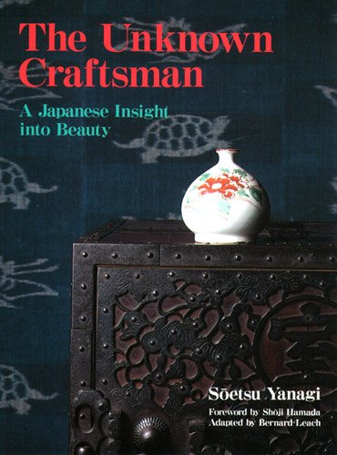
As both a curator invested in contemporary art practices, and as a potter of almost twenty years, I often find myself asking “What does ‘Craft’ mean anymore?” Craft is often considered a four-letter-word in the “big A” art world, and relished in the neo-DIY movement, but is rarely theorized anymore in relationship to our current cultural climate. As a result, I often find myself musing about the two supposedly disparate practices of “High Art” and “High Craft” and the aesthetic interconnections between them. Whenever confronted with this dichotomy I return to the seminal craft philosopher Soetsu Yanagi and his analysis of art and craft in his book The Unknown Craftsman.

theunknowncraftsman

For Yanagi – the founder of the Japanese Arts and Crafts, or Mingei movement, of the early 20th century – hand-crafted objects were the way to re-connect industrialized society with the natural world. First published in English in 1972 during the birth of the microprocessor, the book’s chapter Pattern formulates Yanagi’s manifesto: How pattern is derived, what constitutes both a good and bad pattern, and the ability for pattern to provoke in man a full capacity to perceive the beauty of the natural world. His argument is hinged on the question: “Why have painting and pattern separated? The same cause underlies the idea that divides art and craft: the growth of individualism.”

Yanagi’s question is based on the notion of a “Viewpoint,” a human perspective that allows the artist to distill the beauty of nature into a more refined pattern. When using the example of translating a bamboo leaf into a “mon” – or Japanese crest-  Yanagi creates his theory of pattern based on some of the following principles:

*A pattern is both true to nature and artificial.

*Pattern is nature plus a human viewpoint, and the viewpoint is what
gives content; All patterns are products of a viewpoint.

*Good pattern is frequently rather terrifying. And any good pattern has
an element of the grotesque.

*Pattern does not explain; it’s beauty is determined by the viewers
imagination.

This theory of pattern underscores Yanagi’s entire philosophy of beauty, and articulates his perceived division between art and craft, individualism and collectivism. However, this system of pattern creates a problematic condition for both contemporary pattern makers and painters alike. Yanagi’s model for pattern production is fundamentally productive except for the variable value of the viewpoint. Yanagi’s post-industrial viewpoint has been diminished; our new viewpoint is post-digital.

For most inhabitants of the “developed” world, the simulacric lens of the computer, where all nature is synthesized into a simulation, has become the new viewpoint. Rivers have been traded for iPhone aps, expeditions for Google Earth, and communal banquets for cocktails in Second Life. And the basis of this digital sublimation is the highly skilled craft of code.

Emerging in 1801 from Joseph Marie Jacquard’s binary punched card loom, computer code has become the densest language mankind has invented to express the narrative of the world. Through it’s abstract syntax and consortium of disjointed symbols, code has created the algorithm to translate reality into a fragmented arena of spectacle that is as thin as a computer screen and as vast as the surface of the globe. If language precedes perception, then code has certainly shifted the “viewpoint” from the natural to the digital.

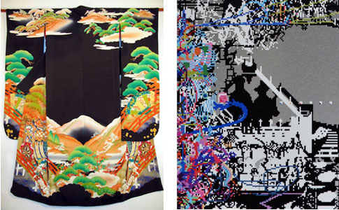
comparison

There is a new generation of artists and pattern makers engaging the structure of pattern from the post-digital viewpoint: Matthew Cella is one of them. Cella, like Yanagi, is nostalgic for the past; for the nature of his youth. The difference is the nature of Yanagi’s childhood is of rice paddies and Mt. Fuji, while Cella’s is comprised of similar subjects represented in the synthetic landscapes of Atari, Nintendo, and Sega. And what Cella does with digital nature is in practice no different than what Yanagi describes in the translation of an actual bamboo leaf into a pattern; he refines it into something more than the original could be. Furthermore, Cella – like Yanagi’s own desires -employs his patterns into utilitarian forms such as rugs. But the question remains: How, if at all, is Cella’s work bridging the craft/painting divide?

As programmer Charles Petzold states in Beautiful Code: “Code is just a smart kind of data – data designed to trigger processors into performing useful or amusing acts.”  One could almost think of this statement in terms of weaving: code is the craft of weaving itself, and the useful act which once produced blankets and baskets, now results in the infinite cloth of pixels that our eyes scour for information. And although Yanagi saw the technological as the bondage of mankind, in what way is this ever increasing craft of code – and all of it’s resulting patterns of pixels – creating a new utilitarian form, new unknown craftsmen, and bringing us together in ways Yanagi had originally only thought possible through our interactions with ceramics and textiles?

In many textile traditions, landscape and narrative are literally woven together through the production of pattern. The socio-technological changes of our world have shifted our forms of representation, transforming our sense of landscape-narrative from the geographic to the sociological. Landscapes and histories have been replaced by networks and communities founded on the craft of code. Perhaps Cella is presenting textile traditions in a new way. Each pixel of Cella’s work represents a collaged fragment of information. It is as if he has cut up the narrative textile traditions of the Pueblo, Celts, and Akan, and haphazardly stitched them back together with the digital pop-culture of the 1980s: The result is the fragmented quilt of the post-modern world.

I wonder what could be gained from a more comprehensive melding of the arts and crafts with digital production? Perhaps Comp-Sci programs could be more experimental within arts and crafts institutions rather than liberal arts colleges and poly-technical schools. Could dot-coms be more productive if they established micro-potteries and looms for their employees rather than ping-pong tables and bi-weekly office parties? In addition to programs such as Google’s local produce initiative, could companies find a qualitative improvement in their employees and product by supporting local artisanal practices? If we accept that our lives have become chaotic and fragmented – largely due to the digitization of our reality – then the incorporation of the ephemerally digital with the haptically crafted seems like a very interesting path to follow.

.

Mike Bianco is an independent curator and artist based out of Marfa, Texas, and is the recently appointed associate curator at Ballroom Marfa. Prior to moving to Marfa, Bianco was the co-founder of Queen’s Nails Projects, an offshoot of Queen’s Nails Annex in San Francisco. In addition, Bianco is also the founder of the alternative arts space The Waypoint, in Marfa, Texas. More recently, Bianco has been focused on developing his projects The California Arts Cemetery in Lone Pine, CA., and a contemporary ceramics residency in Marfa, Texas. For more information about Bianco and his work you can visit www.biancoprojects.com

Long Day’s Journey: 8 Hours With Artist Marina Abramovic" class='title'>Long Day’s Journey: 8 Hours With Artist Marina Abramovic

A really wonderful account and review of the experience of standing in line for “The Artist is Present”

Rhizome’s Seven on Seven a Success" class='title'>Rhizome’s Seven on Seven a Success

I love the nature of this program: match up artists and technologists for 48 hrs and see what you get.  And it is great to hear that it worked to some degree.  I too, would love to see more of these programs.

The Bullshit Artists" class='title'>The Bullshit Artists

Leon Neyfakh calls out the vagery and BS that gives art a bad rap.  It would be so refreshing if this type of language was cut out of the art world. But it’s a fine line.  Sometimes the things that artists are exploring are pretty vague and broad.  But that doesn’t necessarily make their work bad.

The Center For Missed Connections: Charting Loneliness and Social Irrealities

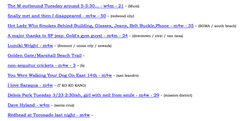
If you live in a city, or even if you don’t, you have likely heard of and/or utilized Craigslist.  From its humble beginnings, the website has grown to international proportions; used to place ads for jobs, housing, and those looking for human contact.  Perhaps the most compelling aspect of the site is its category Missed Connections (MCs).  Here, people post anything from one line to many paragraphs; seeking out those whose path they’ve crossed, people they’ve lost contact with, strangers they’ve seen in bars or cafes or streets that caught their attention.   These posts reflect a desire to try and make real contact, when so much of our lives are spent surrounded by strangers, hours at work, or online.  In the past year alone, these anonymous listings have inspired a book deal, blogs dedicated to the best of MCs, and artists’ work.  Baltimore-based artist Ingrid Burrington has created a piece utilizing Missed Connections that is at once tongue-in-cheek and an adept response to the culture in which we live.

missed-connections

Using her “think tank initiative,” the Center For Missed Connections (CMC), Burrington examines MCs in five cities, charts their trends, and offers a work- booklet so that we might keep a log of our own missed connections as we go about our daily routine.  Were someone to stumble upon her findings, one might imagine these graphs and worksheets to be yet another new dating device aimed at an increasingly lonely urban population.  Rather, Burrington has created an untraditional piece of work that experiments with and questions our understanding of illusion and reality, blurring the two, while also offering an honest commentary on this phenomenon of communal loneliness and need for human connection in our country.  This “outreach initiative” provides a critique of the way in which we communicate, date, relate, and experience loneliness and one another:

“You are in the world, in a city, somewhere crowded and vibrant, full of people.  And you are alert with an awareness tempered by the wonderful, unspeakable loneliness of being among strangers… Missed Connections are the embodiment of one of the major lures of cities and urban centers: they are a temporary engagement with a total stranger in uncertain, finite intimacy.”

Burrington takes a humorous look at what constitutes a missed connection, its various forms, and how one may make their post most successful.  Various categories of what she deems the “gray area” include, “holla,” “bitches ain’t shit,” and “why doesn’t anyone want to date me.”  It’s this superficial cheekiness that cushions the subtext of her work.  Rather than beat her audience over the head with the kind of heavy-handedness one might find in some artists’ whose work deals with social commentary; Burrington’s take is comical, relatable, and an astute critique of the way in which our culture often chooses to interact with one another.

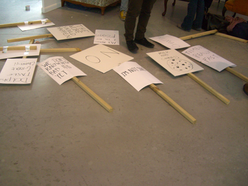
Many of Burrington’s projects take things that are mundane- date books, puzzles, and rulers to name a few- and recontextualize them; endowing everyday objects with cultural substance and social critique.  Her work is often collaborative, and text appears in nearly every piece.  Some take the form of pamphlets and index cards, while others are protest signs or banners that demand “milk & cookies!” or “revolution can be avoided.”

ingrid-protestwhat do we want? NOW! when do we want it? NOW! .     Ingrid Burrington and Matt Bettine  2008.
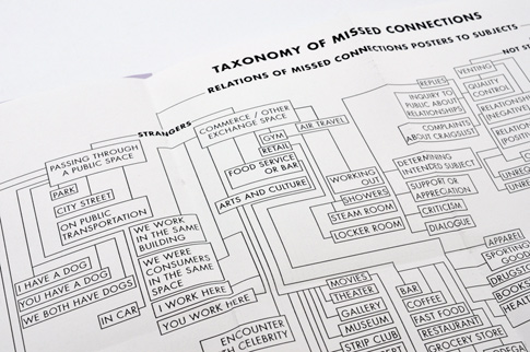
Her work offers a means of resistance to traditional artistic genres, as well as to our current culture and what is valued.  In “Tips for experiencing a missed connection,” Burrington advises her reader how to go about becoming an MC.  Among them, the artist suggests you: be attractive; identify which an adjective (cute, hot, sexy, etc) that best suits you and try to embody it; leave before any actual contact can be made; and start living.  How very apropos that in trying to really live, we abandon actual interaction and possibility in favor of an online fantasy.  It is here, and in other pieces, that Burrington subtly dismantles socially constituted norms and brings them into question.

Burrington manages to avoid heavy handedness as she maps the world of MCs.  Rather than create a piece that mocks those who flock to Missed Connections in lieu of real human contact, the artist offers us a thoughtful, rather blithe take on the palpable loneliness that seems to proliferate so many of these posts.  Between Match.com, OkCupid, eHarmony, and myriad other dating sites, it’s no surprise that we (the collective we) have become disconnected.

If such sites weren’t to exist, would we still feel the same lack of connectedness?  It seems that in attempting to quell the feeling of loneliness and isolation, dating sites may compound the feeling; allowing people to search for others at their leisure and in the comfort of their home.  Rather than step out into the world where rejection is a real possibility, those who date online only have to face a virtual one, and can quickly move on to the next profile.  CMC is a critical look at this delusional approach to interaction, and acknowledges the irony in our attempts to establish contact via Missed Connections with those we wish to engage in reality, but actively choose not to.

taxonomydetail_485Taxonomy of Missed Connections, detail.  In the Center for Missed Connections Citizen’s Field Guide, Center for Missed Connections Information Initiative, 2010
In CMC, we are given statistics, pie charts, and insights into the workings of each city’s MCs.  It’s in this urban sea of strangers that we make a connection, and perhaps we find comfort in this collected loneliness.  In CMC and other pieces, the artist dares the viewer to ignore this current state of detachment in which we seem to exist.  As Burrington navigates the world of interreality through various non-traditional formats, she manages to create works of art that are simultaneously provocative, critical, and humorous; and through them we are given a glimpse at how our culture has dissociated, as well as our genuine desire to find a connection amidst this often self-imposed isolation.

.

.

.

Madeleine Zinn is a writer and erstwhile artist based in Oakland.  Her main interests include non-fiction, community arts, pop culture, and queer theory and identity politics.  She is currently pursuing a dual MFA/MA in Writing and Visual & Critical Studies at California College of the Arts.

And I feel Fine by Heidi De Vries

It is a truth universally acknowledged that many Californians, despite willingly living on land that could open up at their feet and swallow them whole at any given moment, possess nothing even remotely resembling a proper emergency kit.  Until very recently I was no exception.  I was born and raised in California and have ridden out more earthquakes than I care to count, and still it took me until I was in my early 30s before I finally ordered a pre-packed bag full of emergency supplies from the Red Cross.  Of course my grasp of what to do with the many items in that backpack is tenuous at best, but I’m operating under the assumption that if disaster strikes I’ll have a spare moment to read its enclosed manual.

Upon first inventory the purpose of the contents of Whitney Lynn’s survival kit might seem similarly mysterious, but here too there is a manual.  Her pamphlet immediately inspires confidence with its promise of useful information, its cover printed with an official-looking logo as well as a variety of acronyms that could be military codes.  Lynn did not make these up; they are actual acronyms that would be familiar to anyone in the survivalism movement.  For example, “SHTF” stands for “Shit Hits The Fan”.  “TEOTWAWKI” is “The End Of The World As We Know It”.  Survivalists do have a sense of humor.

By inviting participation in the piece Lynn quickly draws you into an imagined narrative, encouraging you to picture yourself in a situation in which this kit might be necessary and useful.  Perhaps you’ve chosen to sequester yourself away in the woods to kick-start your creative process with a dose of isolation and would use the items to meet some of your basic needs, like the alcohol you can make with the yeast and the balloon.  In a more pessimistic scenario, perhaps one of the laundry list of catastrophes called out in the pamphlet has occurred and it’s every individual for themselves, in which case assembly of the DIY Survival Weapon, cleverly labeled as such, takes on a new sheen of urgency.  In any event you can always draw motivation from the artwork on the back of the pamphlet, included to provide inspiration.

Our ancestors who lived a lot closer to the land than many of us do might be puzzled about why we would need this kit, and they would also probably laugh at the earnestness with which the present-day sustainability movement exhorts all human beings to reduce/reuse/recycle.  There was a time when such a philosophy wasn’t even optional.  However, in these days of industrial agriculture and the supermarkets’ pale, hothouse-grown tomatoes, it can feel like a powerful decision to eat a fresh heirloom from a home garden or a local farm.  But then ideas about self-sufficiency are taken to a whole other level by the modern survivalists who in the case of societal collapse are prepared to live completely by their own means — and surrounded by all the supplies they have purchased in advance.

Lynn has chosen banal, everyday objects for her kit but invests them with unexpected meanings by framing them up within the new context of “failure management“, and in this way she nods to the genuine resourcefulness and creativity required to be a successful survivalist.  She has also created a cohesive brand for the kit that slyly pulls from survivalism literature and terminology, referencing both the consumerist culture that survivalists need in order to stock their bunkers as well as the fear of its disintegration that drives their actions.  Buy early and buy often, before there are no stores left.

The ideal of stubborn individualism is deeply ingrained in the stories of the early United States, from almost-mythical figures like Daniel Boone and Davy Crockett to images of the ‘49ers and other pioneers staking out new territory during the country’s insatiable expansion west.  Modern survivalists might feel like they are tapping into that spirit of the original American do-it-yourselfers when they visualize themselves hunkering down alone in a well-provisioned cabin.  Except the people who actually did survive in those days of yore were the ones who turned to their neighbors for mutual help and support instead of locking their doors against them.

Heidi De Vries works as a manager at an advertising company by day and freelances as a writer and a music consultant.  She is also a volunteer DJ at KALX Berkeley 90.7fm, and though her show is currently on hiatus she would be happy to recommend some awesome tunes for you anytime. You can find her at her blog, Engineer’s Daughter.

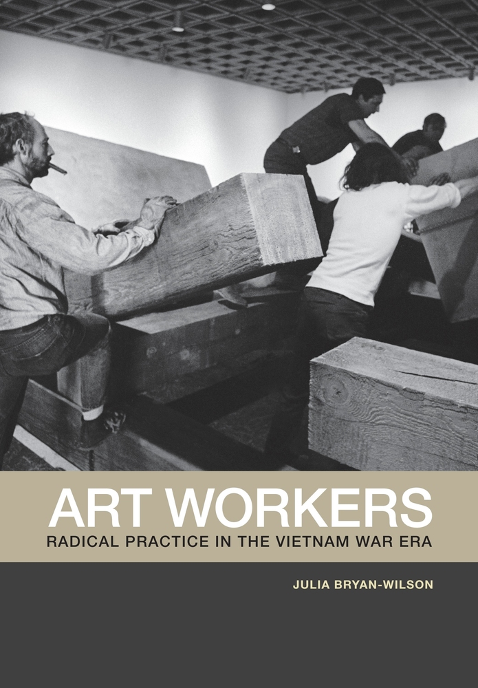
Art Workers: Radical Practice in the Vietnam War Era

artworkersbook

Julia Bryan-Wilson, director of the Ph.D. program in visual studies at the University of California, Irvine, investigates in her new book the movement to create a new recognition of artists as workers and laborers in the 60′s and 70′s.   Their efforts created some change within the museum structure, yet it continues to be a struggle today, as seen with efforts of W.A.G.E. and our “State of the Arts” project led by Joseph del Pesco.

Julia Bryan-Wilson on Artforum.com:

THE MORE INTERESTED I became in the legacies of the Art Workers’ Coalition and the New York Art Strike, the more I became concerned with how artistic labor registers––or doesn’t––within a wider field. It was both inspiring and somewhat vexing to consider how artists and critics attempted to organize as workers and label themselves as such, particularly during the Vietnam War, when debates about the value of artistic production were raging within culture and within protest politics. How does art work? This question challenged me and pushed the project forward.

…read more on Artforum.com

Her book has been published by University of California Press and there will be a release party at Printed Matter in NYC on November 7th.

A Time Alongside Time by Matthew David Rana

“[A] qualitative alteration of time…would have the weightiest consequence.”
-Giorgio Agamben, Infancy and History

Waxing its way to fullness, or waning its way to newness, the double promise of enrichment and becoming has been brought to bear on the moon. As a venerated celestial body and object of astronomical contemplation, the moon has been made to transcend itself as a powerful and resonant symbol. It is capable of teaching us about our position in the cosmos while providing a distant location on which to pin our hopes and desires.Whether it?s being shot for or leapt upon, the moon, like the starry firmament that surrounds it, is a reminder both of our limitations as terrestrial creatures and our intractable persistence in the face of an incomprehensible vastness.

In his book Infancy and History, Giorgio Agamben speaks to this kind of existential angst when he writes of time as a moment of tension where action and potentiality converge and life is revealed in its totality. Drawing on the ancient Greek notion of cairos, he emphasizes not being a slave to time as a universal or historically unfolding abstraction. Rather, for him, time issues from the specificity of human acts. As action without time
would be meaningless, so is time without action rendered desolate, void. To paraphrase Hakim Bey, it?s the idea that since we refuse to be nothing, there must be a project. In this sense, time can be thought of as something intensely personal, a unique form of temporality inflected by one?s actions within the flow of experience.

While not quite the revelation that Agamben described, my experience with Helena Keefe?s “Phases of the Moon,” was of qualitative alteration. The time that issued from the modest gesture, enacted daily for one synodic month, of affixing to my clothes a pin representing the changes in the moon?s phase, was a peculiar one in which my place and position in the world were thrown. As I repeated this aesthetic act, a major principle around which my daily life is organized began to loosen its hold. My orientation shifted away from a solar calendar and towards a lunar one. Although the new structure remained cyclic and related to the sun, I began to behave differently. I developed a ritual: check the widget, replace the previous day?s pin and attach the new one (rarely have I dressed myself with such intentionality and care). Having gained an awareness of the moon that I previously lacked, I began seeking it out at night, verifying that I was properly synched up. Although the act bore similarities to the careful placement of a flower in a lapel or the jauntiness of a feather in a cap, it was more than an anachronistic or ironic flourish. Somewhere between a Victorian-era locket and a campaign button, the pins themselves drew equivalences between the time produced by ritual and remembrance and the time produced by discourse and communication. More subtly, they came to represent a time in which what?s private and what?s public can productively exist together.

For a time, I was in a time alongside time. To try to recover or extend that time, to cultivate it and make it something enduring would, I think, be to somewhat miss the point. The message is a bit less dramatic than that. It?s even less complicated than a faith in the promise of the fleeting moment. In fact, it?s deceptively simple: for even our smallest gestures, there are weighty consequences


Matthew David Rana
is an artist and writer based in Oakland. He is a featured contributor to Art Practical and his writing has appeared in the books, There is No Two Without Three and I’m a Park and You’re a Deer. Matthew is also co-director, with Michelle Blade, of The Living Room, a storefront project in Oakland. He is currently pursuing a dual MFA/MA in Social Practice and Visual & Critical Studies at the California College of the Arts.

Supermarket Still Life

“Tell me what you eat, and I will tell you what you are.” -Jean Anthelme Brillat-Savarin1

As an omnivore, the human body can survive and maintain its health on an astounding array of diets. Our ideas about the foods we eat, however, are cultural. Until only the past few generations, eating habits and food cultures were passed down the generations by the shared meal experiences of families and social groups. The industrial farming practices and global shipping routes developed in the 20th century upended these evolutionary relationships, supplanting the ideological roles of mother and tribe with supermarket capitalism. Not only do agribusinesses provide the diverse foods we eat, they provide their own cultural context, communicating new memes of taste, health, and culture. In a critique of the marketing of industrial organic foods, Michael Pollen unpacks such culinary signifiers in The Omnivores Dilemma:

“Taken as a whole, the story on offer in Whole Foods is a pastoral narrative in which farm animals live much as they did in the books we read as children, and our fruits and vegetables grow in well-composted soil … “Organic” on the label conjures up a rich narrative, even if it is the consumer who fills in most of the details, supplying the hero (American Family Farmer), the villain (Agribuisnessman), and the literary genre, which I’ve come to think of as Supermarket Pastoral. By now we may know better than to believe this too simple story, but not much better, and the grocery store poets do everything they can to encourage us in our willing suspension of disbelief.”2

This disconnect between our ideals of food production and its practical realities is bridged by visual language. As the narratives are consumed, they produce comfortable illusions about the substance of our food, providing a false culinary wholeness, like a gastronomic Potemkin village.

It is the cocoon of food packaging that envelops Stephanie Dean’s Modern Groceries series in contemporary consumer life. The photographs reenact Dutch still life master paintings from the fifteenth century, capturing the oblique soft light and deep shadows in saturated color. Objects are arranged with the same aesthetic fetish, displaying the bounties of the harvest and trade, as well as objects of curiosity, arranged perfectly askew over intricate linens and drapery. The produce, meats, and cheeses in the photographs are the same as their historical counterparts, but revealed to be modern industrial agricultural products by their packaging. Their presence subverts the bucolic ideals of the produce; the plastic is there to protect the food while it is transported globally and provides the surface where a plant can be re-branded into an emblem of the Supermarket Pastoral. The most visually subtle image in the series, “Still Life with Strawberries,” generates this subversion with only transparent plastics and a cluster of pricing stickers. An ironic disposable quality leaches from the packages, given their synthetic ecological permanence, in contrast to the finely crafted tableware and voluptuous produce.

citrus2008
Citrus, 2008

By employing the visual archetype of the still life, Dean frames the work within the historical tropes of the Dutch master painting. The Dutch still life marked a shift in the visual content and economics of European painting in the fifteenth century. These canvases were commissioned by a rising merchant class, not the aristocracy or church, who had underwritten most previous art production. The merchant-traders sought depictions of what brought them power – goods produced by guilds or secured in trade – just as the aristocrats and popes commissioned works of religious, mythical or political authority that supported their ideological dominance. These paintings built a representative system that redefined the commercial products of the time into an ideal, much like the marketing techniques documented in contemporary grocery stores by Michael Pollan. Furthermore, the down-to-earth aesthetic of understated wealth on display in the paintings mirrors the criticisms of elitism and affluence frequently pointed at today’s progressive food movements such as Slow Food.

In this way, the Modern Groceries series can be seen as a critique not only of contemporary agricultural practices, but of the manipulative power of visual language. At the same time, the photographs delight in the pleasure of the food and the seductive beauty of nature and light. The images dwell in a cognitive disconnect of the sensory and the political – a feeling that many of us experience every week, as we push our carts down the aisles of our favorite grocery markets.

linebreak

1 Jean Anthelme Brillat-Savarin, The Physiology of Taste, 1825
2
Michael Pollan, The Omnivore’s Dilemma: A Natural History of Four Meals (New York, USA: Penguin Group (USA) Inc., 2006), 137.

Brian Andrews is an artist who works with photography, video, and emerging media. Not content to just make things, he records as the west coast producer for Bad at Sports Contemporary Art Podcast. His critical writings can be found on Artnet and in Beautiful/Decay Magazine, as well as in numerous catalogs. Currently, he is the Course Director for the compositing program in animation and visual effects at Expression College for Digital Art in Emeryville, California.

Call for writers: new Flash Points topic wants you! | Art21 Blog

Attention writers! Our newest Flash Points topic, Contemporary Art + Economics, launches next week. This time, we’re opening up the editorial process and inviting you to participate. Have an idea for a post? Interested in what’s going down on Capitol Hill or how the current economic climate has affected the arts closer to home, in your own community? Propose a Flash Points blog post and have a chance to be featured on this site.

Posted via web from thepresentgroup’s posterous

Swelling, Shrinking, Fragments: David Horvitz By Genevieve Quick

Synecdoche allows a part to stand in for the whole, pars pro toto, as in using the word “wheels” to stand in for a car.  Synecdoche not only substitutes, but “swells” the part and “fragments” the whole.

Asyndeton eliminates conjunctions and adverbs in a series and uses “fragments”, rhythm, and timing to “shrink” the descriptive, communicative, or narrative act, to produce an extemporaneous or climatic tone.

David Horvitz’s work intervenes in the banality of the everyday through simple gestures that harness everyday media (web-based, print, photographic, and audio media) to engage his viewers in his activities.  In The Practices of Everyday Life, Michel De Certeau illuminates the myriad of creative opportunities that exist within the minutia of everyday activities using the grammatical principles of synecdoche and asyndeton.  When applied to the pedestrian aspects of life, typically taken for granted, they allow the everyday to be inscribed and read with nuance, complexity, and a multitude of meaning.  Horvitz’s work demonstrates how the synecdochical quality of souvenirs and the asyndetic nature of the View-Master swell, shrink, and fragment ideas and images and how banal media formats (e.g., photographs, texts, etc.) and distribution channels (e.g., websites, email, and the postal service) can be mined for their ability to share and extend narratives to remote observers and participants.

In the ultimate victorious gesture for the capitalist world, in 1989 Macy’s sold fragments of the Berlin Wall to allow people to share in an event that while globally significant, really only effected most US citizens remotely.  Souvenirs’ material quality, i.e., its ability for a sea shell to stand in for a trip to the beach, creates an expansiveness, a “swelling” of the reference and of the networks of participants to include those who are only remotely involved in the actual event.  In his series Things for Sale I will Mail You, Horvitz harnesses the web and Pay-Pal to interact with his viewers.  On Horvitz’s website he has established several goals to achieve and accompanying budgets that he invites his audience to purchase, or donate towards, and in exchange receive mailed documentation or souvenirs from the piece.  The gestures in this body of work range from the simplest, where Horvitz will think about you for one minute, sending you emails at the beginning and end of your dedicated time, to the more elaborate that stipulate that Horvitz will travel to Iceland; rent a car; mail you a lava rock, a photograph of the Aurora Borealis, and a photograph of him inthingsforsale the hot springs thinking about you.  All three items will be mailed to participants who donate more than $150 or who buy the whole piece for $2,443.   For some, Horvitz’s work begins with his website, then progresses to purchasing or donating through Pay-pal, then receiving documentation or souvenirs through the mail, and lastly the participant may monitor his website for further updates.  All of this may occur without ever meeting or speaking to Horvitz himself.  For most of us who do not participate by donating or purchasing Things for Sale. . ., our involvement is even more remote, as we only participate through monitoring Horvitz’s website.  Moreover, the souvenirs and documents that Horvitz mails his participants and displays on his website verify that the events have actually taken place, as the anonymity of the web makes us all incredulous consumers and participants.  Susan Stewart explains that, “[w]e do not need or desire souvenirs of events that are repeatable.  Rather, we need and desire souvenirs of events that are reportable, events whose materiality has escaped us, events that thereby exist only through the invention of narrative.” (135 Stewart)  Because the, “materiality [of Horvitz’s work] has escaped us”, the only ways that we, as remote viewers of his work, can experience Things for Sale. . .  are through his website where he constructs his narratives and through the synecdochical souvenirs and documents.  The souvenirs that Horvitz mails his participants are traces or residue of the art act itself.  The art piece is not so much the lava rock or the photographs, but the act of trust and cooperation that occurs between Horvitz and his participants.

In Hermosa Beach, CA, Horvitz utilizes the View-Master, which was based on the late nineteenth century stereoscope and debuted at the 1939 New York World’s Fair as a 3-D alternative to the post-card, itself a souvenir.  Like the stereopticon and magic lantern (the forerunner to the slide projector) that preceded the development of the motion picture camera, the View-Master operates asyndetically:  like jump cuts, it shrinks time by juxtaposing or creating a series of ideas, words, or images without transitions.  When the viewers are screening the images in Hermosa Beach, CA with the View-Master, they do not see the sequence numbers printed on the reels and quickly loose track of where they are in the series of images, as the only difference is the shifting formation of waves in the background.  The beginning and end are irrelevant or nonexistent as the viewer moves abruptly from image to image.  While Horvitz indicates in the accompanying text that the whole shoot took an hour or two, the time frame between images is ambiguous, as any transitions that would indicate how much time has passed have been eliminated.  Moreover, Horvitz explains that he would shoot his images, tell his mother he was done, she would turn around, and he would reload his camera and repeat the process with much of the time spent in silence.  The repetitiveness and silence of the shooting is mirrored in the viewer’s experience of screening the images through the View-Master.  The narrative that Horvitz provides transforms the images on the View-Master reels into documents or souvenirs of an event and urges the viewers to compare their experience of looking through the View-Master with what we know from the text about this event in December 2008.  Like much of Horvitz’s other work, the viewers participate in this event remotely, voyeuristically, through rather banal textual and image based narratives.

Horvitz’s strategies range from mailing souvenirs from distant locations and sharing simplistic images all with a wry sense of humor or a sincerity suggestive of a naive boyishness.  Horvitz uses the ease with which communication is established (email, YouTube, Tumblr, websites, etc.) to establish contact with his viewers and balances the alienation of the web, where everyone is a MySpace friend, with the very personal relationships between friends and family.  While Horvitz’s participants may do very little in terms of actual interaction with him, they are necessary for the work to be successful.  As, De Certeau would assert, while most of us are not primary producers, from a top down perspective, we are neither passive consumers.  Rather, by working within the pre-existing social, spatial, conceptual structures, we have the ability to reconfigure and restructure meaning.  By applying synecdochical and asyndetic devices, Horvitz creates alternative stylistic ways of organizing the world, communicating with each other, and creating narratives.

Sources:
De Certeau, Michel,  The Practices of Everyday Life,  University of California Press,  Berkeley, Los Angeles, London,  1984.

Stewart, Susan,  On Longing:  Narratives of the Miniature, the Gigantic, the Souvenir, the Collection,  Duke University Press,  Durham and London,  1993.

Genevieve Quick received her MFA from the San Francisco Art Institute and has shown her work in galleries in the Bay Area.  She has done residencies at Yaddo and Djerassi and included in exhibitions at the Headland’s Center for the Arts.  Quick is co-curator of the traveling exhibition “Gold Rush: Artist as Prospector”,

Her personal website is www.genevievequick.com.

Next Page »

Web hosting that supports artists.

Archives

  • TPG21
  • TPG20
  • TPG19
  • TPG18
  • TPG17
  • TPG16
  • TPG15
  • TPG14
  • TPG13
  • TPG12
  • TPG11
  • TPG10
  • TPG9
  • TPG8
  • TPG7
  • TPG6
  • TPG5
  • TPG4
  • TPG3
  • TPG2
  • TPG1

Lego Hello World
I wish all my printers were made of legos.

LIFE photo archive hosted by Google
Images from Life Magazine going back to 1860′s, hosted by Google

Coming Face To Face With The President
Well crafted story about an under-heard point of view.

In California, Pot Is Now an Art Patron
A new funding source for the arts – reaping big rewards and funding many projects.  It’s pot.

Notes on Portraiture in the Facebook Age

Celebrity Book Club: A List to End All Lists
Because, well, it’s sortof awesome.

Are "Artists' Statements" Really Necessary?
The pros and cons about that nemesis for most artists.

This to That
You tell it what you’ve got and it’ll tell you what to glue them together with.

Work of art: Online store for buyers, sellers
Not the TV show!  Kelly Lynn Jones from Little Paper Planes is interviewed on her project, gives us a cheat sheet to local affordable art resources.

How to make a Daft Punk helmet in 17 months
whoa.